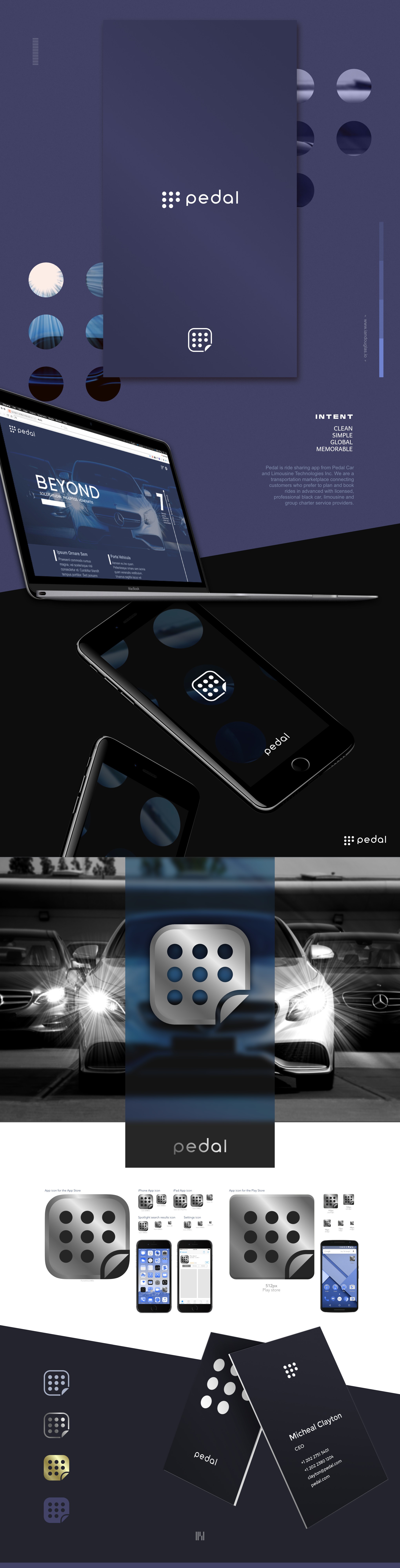
Clean, global mark for a car sharing app

197
Created on 99designs by Vista
The client is building a car sharing platform for higher end business-level travel. They needed a flexible mark that could work equally well in a number of different contexts, from print and advertising to mobile applications. I created a pedal with nine spaced dots, minus one. The dots represent grip pads typical to the pedal of a high-end vehicle, while removing one leaves a P as a recognisable icon particular to the business name. For mobile application use, I add a page turn at the lower right corner, to signify paging through, or choice. The dots without that frame, meanwhile, make for great collateral for advertising. The icon is paired with a custom wordmark, balanced, clean and distinctive on its own.