
Created on 99designs by Vista
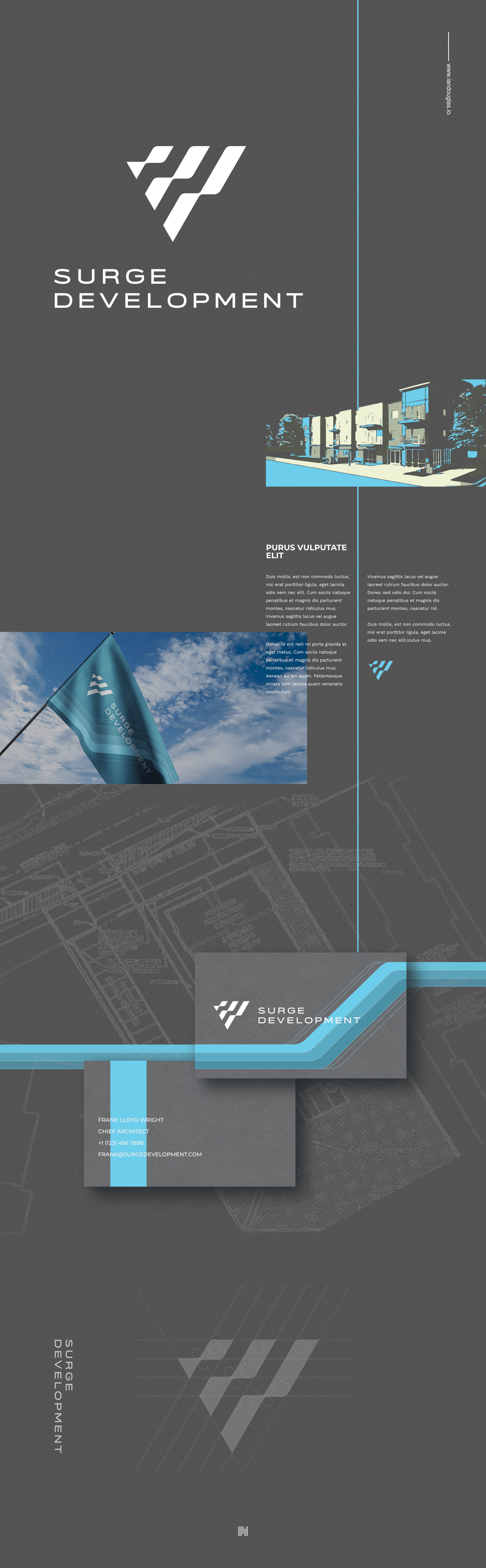
Surge Development is a US company that develops multi-family housing nationwide. The client was looking for a unique and simple design that could ground their efforts to build their national profile. The client chose the name Surge as "a sudden powerful forward or upward movement" and was looking for a design to encapsulate momentum, movement, energy, and building towards something. Conscious of the aesthetics of the construction and real estate sectors, I created this mark that represents a wave form in a bold manner. The mark also plays on the form of the letter S. Simple, dynamic and strong, and fitting as an emblem in the construction and development industry.