Minimalist and literal mark for Cherry Tree Investments

142
Created on 99designs by Vista
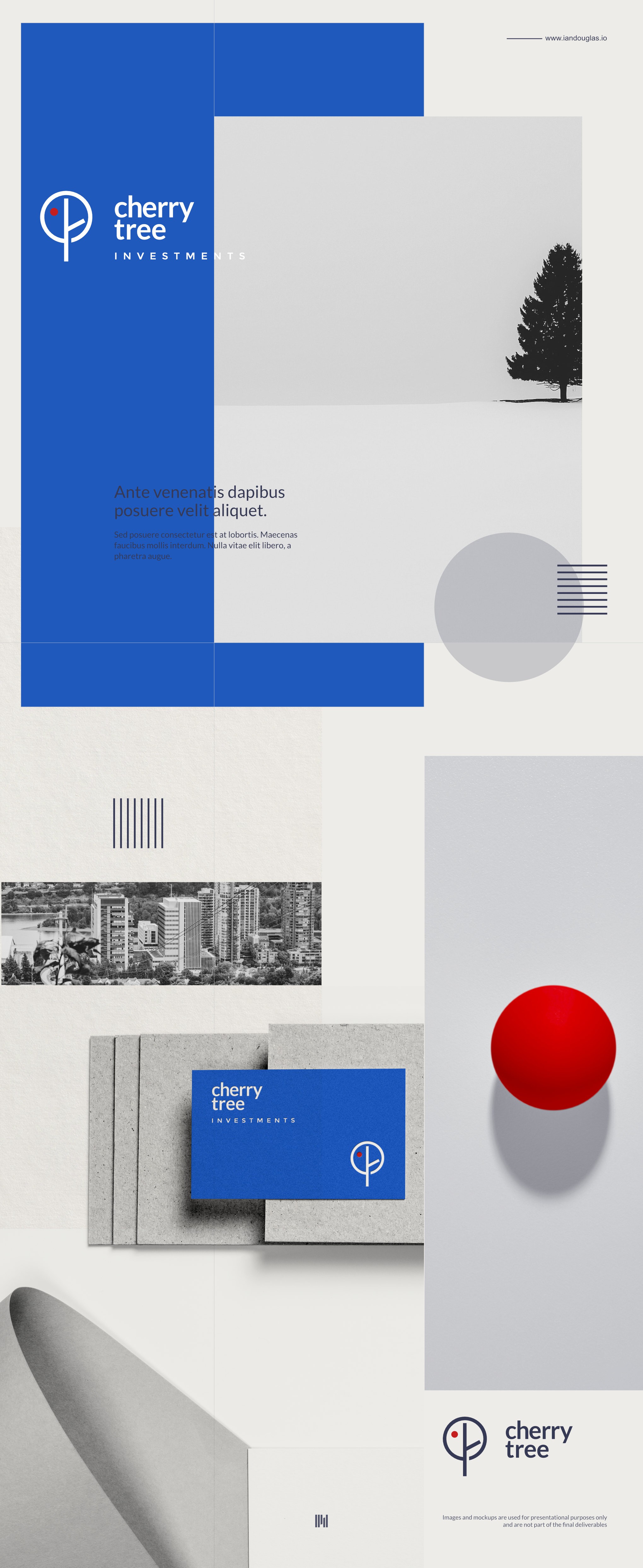
Cherry Tree is a real estate investment company targeting institutional investors, banks, pension funds and high net worth individuals.
My approach here is "the least design possible." Literally, cherry plus tree, and the barest bones of each.
With the mark in place, I then focused on its context, the typography, and decided on a Bauhaus/Swiss International Style approach, to add youthful verve in an often staid business field.
Sometimes a more traditional all caps sans serif really works. But I also recognise the penetrative effectiveness of other approaches.
Eminently legible, clear, and clean, this lower case approach pairs nicely with the mark, creating both a foundation and space for developing the brand.