
Bond & Kingsley is a new brand in the making in the health and wellness field.
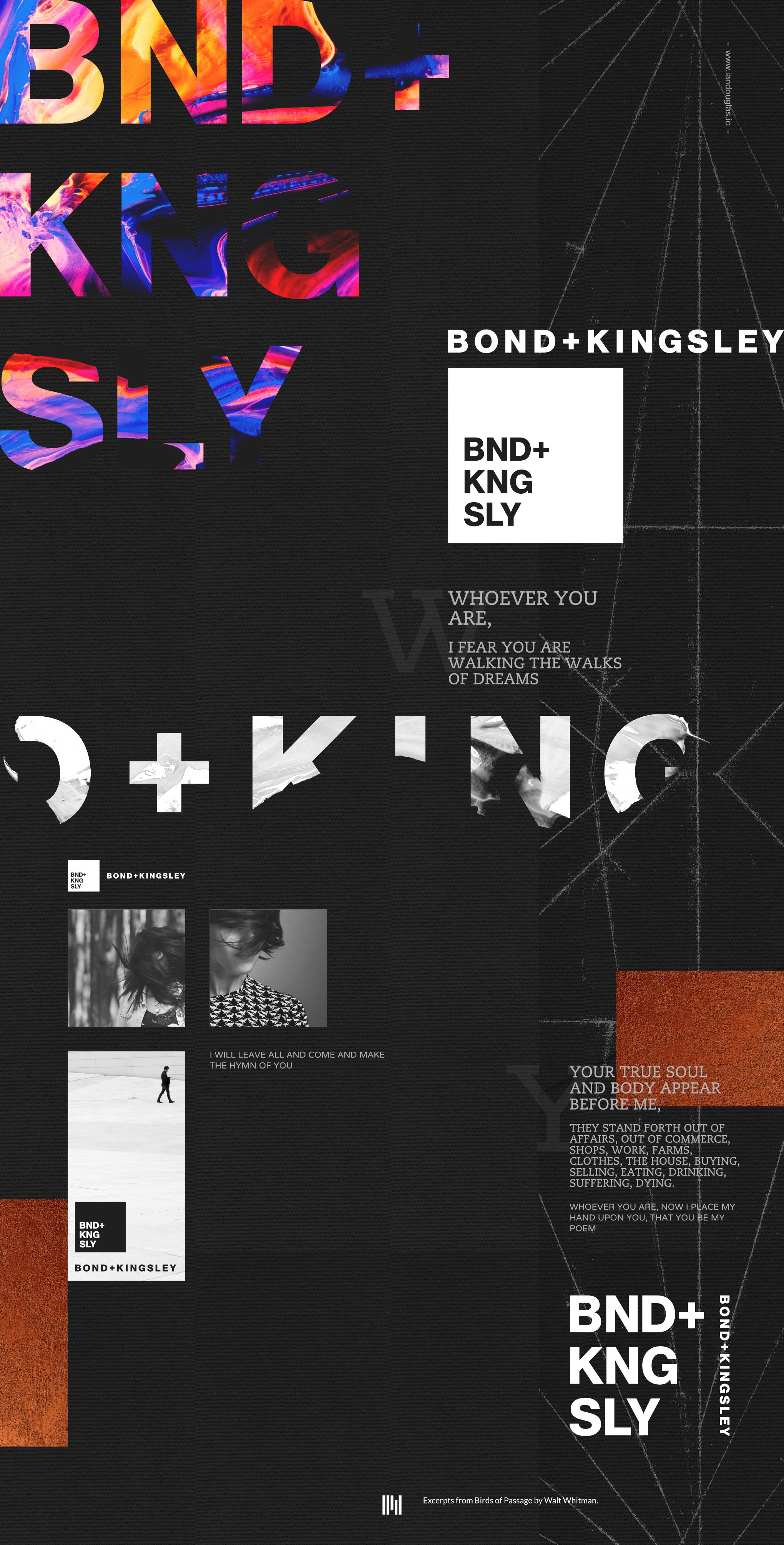
The client is an avid fan of 20th century design modernism — the so-called International Style in design. The likes of Herbert Beyer, Walter Drexel, Theo Van Doesburg, Ernst Keller and Josef Muller Brockmann.
Bold text. Luxurious, but simple.
After exploring a number of monogrammatic marks based around geometrical forms, we arrived to this: a classic, strong, type-based logomark.
The vowels are removed. And in the tradition of the old masters, often the name will be repeated by paring the logo with the name.
The ampersand was replaced by a plus sign.
And as we explore from here and build out the brand, I hope we will see a level of chaos enter, along with bold and striking colors, contrasted by a generous canvas of matte black.
I'm excited about this project.