
Created on 99designs by Vista
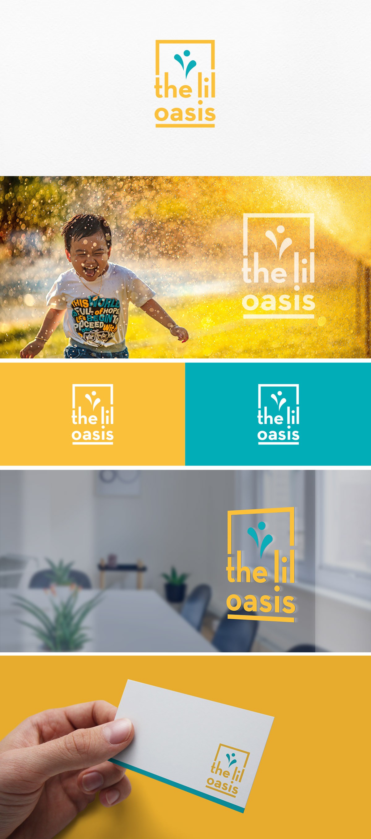
Inspired by the name and abstract silhouette of a child, the lil oasis logo comes to life by pairing a fun and dynamic icon with some relaxed lowercase text. Seeking to appeal to parents, the logo is bold and legible and children can connect by crafting minimal shapes and type that is easily distinguishable, as well as incorporating colors that are bright and youthful.