Professional Brand for Parity

74
Created on 99designs by Vista
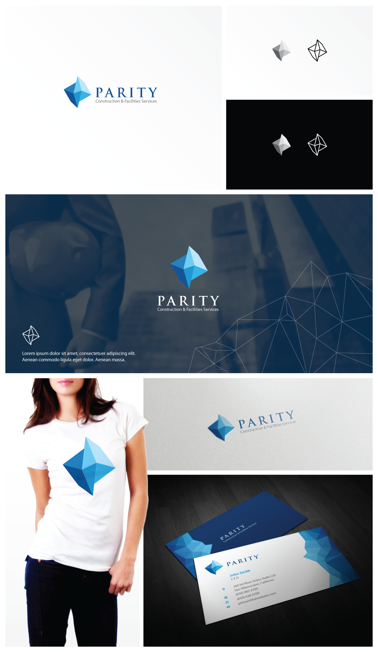
Started from the 'parity' concept I created this shape of logo as a representation of a construction company. I made some polygon vector with blues color palette to reinforce the brand identity. I am quite satisfied with the result, except the font choice where the client has chosen and has specified it.
The next few months, I have been given the opportunity to rework on this project by renaming the business and building the website.