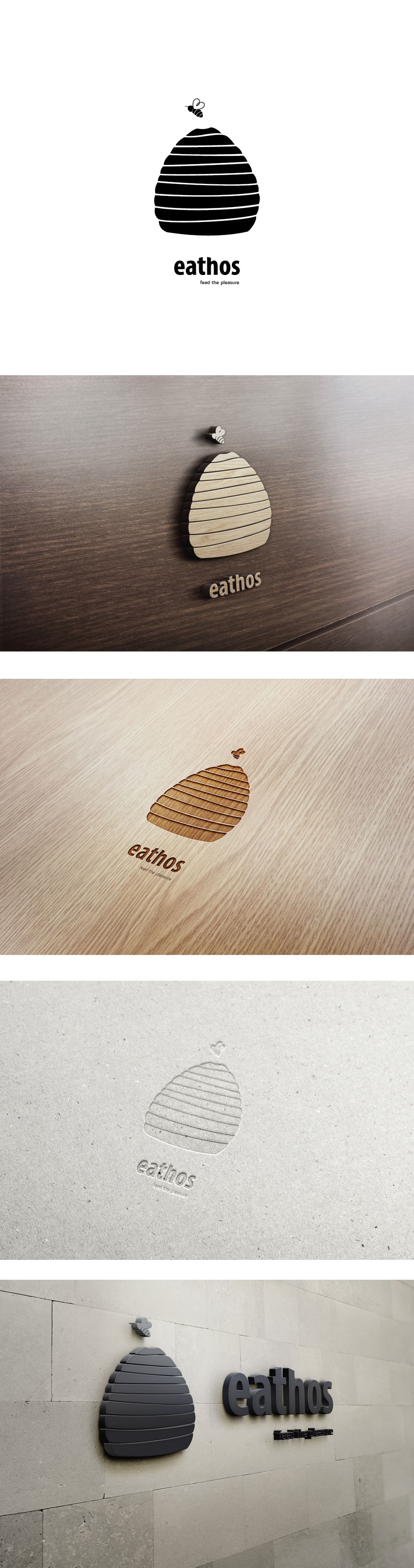
Logo for food production company

20
Created on 99designs by Vista
That was a logo design for commercial company specialized in high quality food service equipment for professional kitchens.
The graphic element had to be one color, nice, emphatic, gentle rounded shape, that would be easily recognizable, conveying the company's values. It also had to explain the company's name Eathos - a place where to live, feed with quality and
respect the earth where all we live.
So I decided to stick to something natural and the first thing that I tried was an egg shape. The client liked the idea, but wasn't absolutely sure about it, so I kept on trying to find the perfect symbol. And finally came up with this beehive.