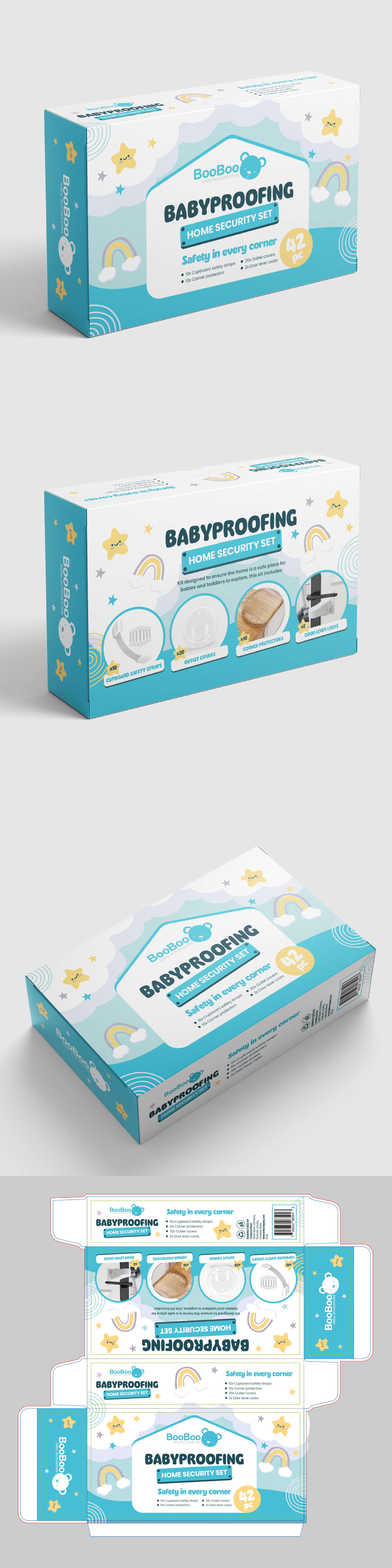
Fun, friendly and safe packaging for a great baby-proof kit.

13
Created on 99designs by Vista
After analyzing the client's briefing, we were clear that the strategy to follow had to make the packaging fun and safe.
The design concept revolves around security, complemented with fonts consistent with the style we want to convey, such as the main one, which is decorative and fluffy. A palette of pastel blues contrasted with subtle yellows and violets that make the packaging light.
Although it is a safety product for babies and small children, the packaging must be direct and concise in the information of the buyer who will be the parents. That is why the design is also friendly and simple.