
Created on 99designs by Vista
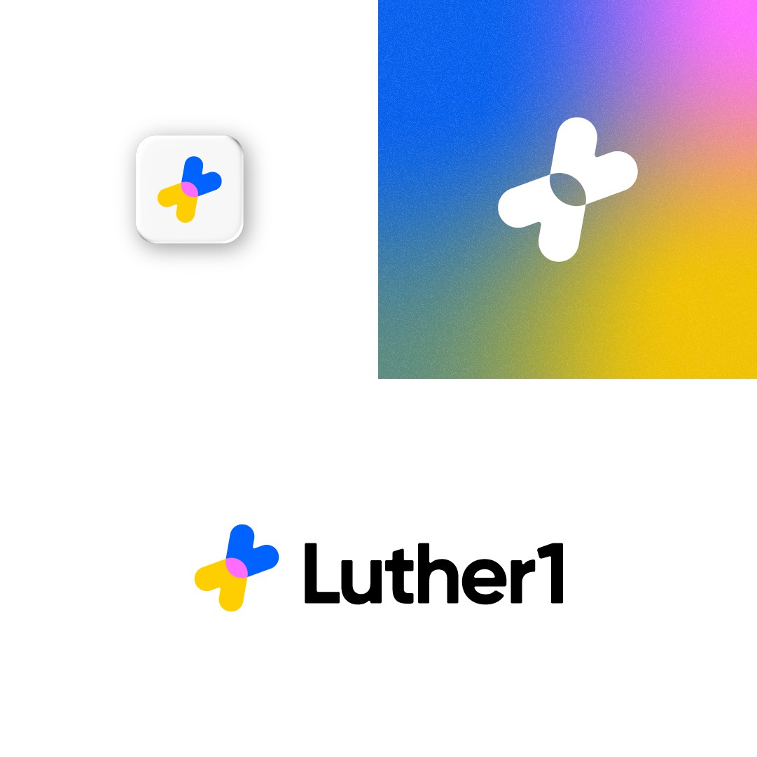
I made this simple mark using an abstract L and an abstract 1 which are intersecting. At the same time, the 2 shapes could be seen as 2 arrows facing each other, which would represent how collaboration and innovation get to meet in this project.
But this design uses another symbol to express a certain look & feel. More precisely, it is the + symbol, which stays for the addition of new people to the team of the client.
It is balanced, it is simple, it stands out and it's also versatile.
The name is a little bit rounded to make it convey that friendly side.
And I picked the colors to highlight the 'innovation' side of the platform.