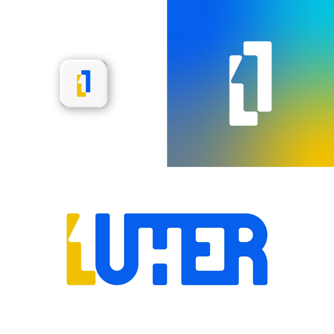

I subtly introduced the 1 between the L and the U, but at the same time I used the T to create the H.
Of course, it was made from scratch on a grid, and that's how I created this geometrical, symmetrical wordmark.
To make it more warm and friendly, but still keep its' professional look, I rounded the corners a little bit.
Of course, the L and the 1 alone wouldn't be legible on a black and white background, so for the logo mark I simply reflected the L. Now the mark is not only distinctive in its' own way, but is also more powerful and balanced.
When it comes to colors, the sky is the limit here. We can use a lot of combinations - 2 colors, 3 colors, gradients, black&white, anything.
I thought of yellow because of the warmth & friendly attributes mentioned in the brief, while blue stays for the innovation part. The contrast between blue and yellow is very good from a design point of view, but as I said, I am open to your suggestions.