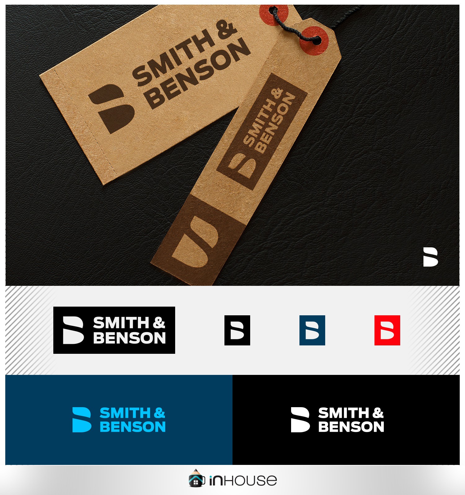
The idea of this design was a clean, memorable symbol , consisting of the letters S and B fused in a balanced way .