
Created on 99designs by Vista
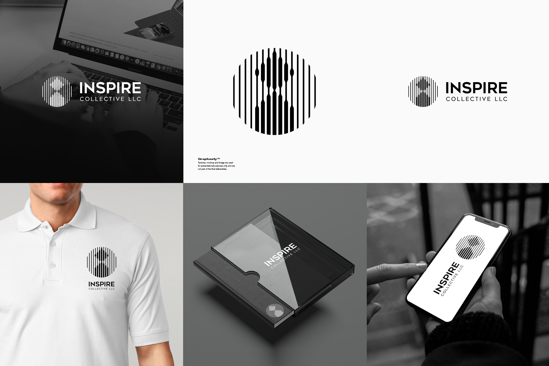
Just finished a challenging project for a regular client. Both the client and I are happy with the final result. The logo concept uses vertical lines to form a stylized "I" that also resembles human shapes, symbolizing unity and collaboration. The circular frame suggests harmony and balance, reflecting the company's inclusive approach to services.