
Created on 99designs by Vista
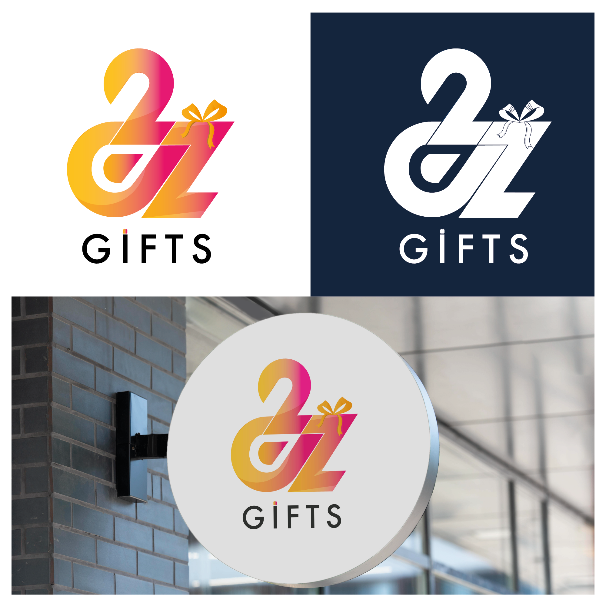
1. The merging logo of A, 2, Z where each corner looks unified with the meaning A2Z is a solid company or business entity.
2. In letter A, the circle with sharp corners is seen as a consistent form and consistent relationship with business partners, while the pointed shape is a depiction of a company that is solutive and always innovates in every era.
3. Matching the form of number 2 is a depiction of a strong and reliable company character.
4. In the form of the letter Z is a depiction of a dynamic and adaptive company.
5. In letter I the dot above is replaced with the shape of a gift box and the shape of a ribbon above the letter Z where the shape is the identity of the company.