Monogram Logo for a Real Estate Company

41
Created on 99designs by Vista
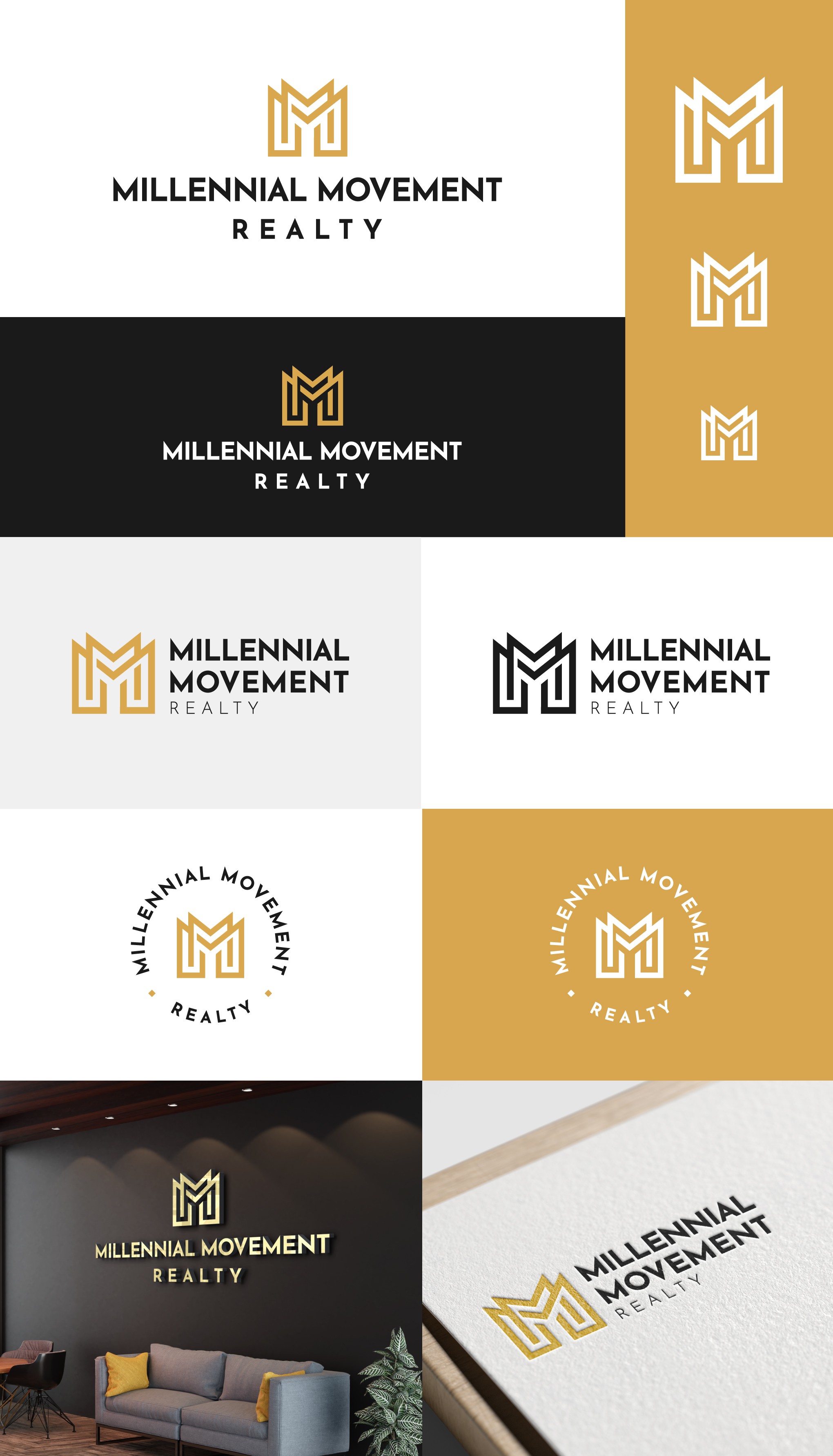
The idea behind this concept was to design a unique, modern and in a same time elegant MM logomark representing the first two letters of the brands name. After the final revision this typography was changed with a less sharp typeface giving more friendly approach to the whole design.