1601 Law Group Logo Concept

25
Created on 99designs by Vista
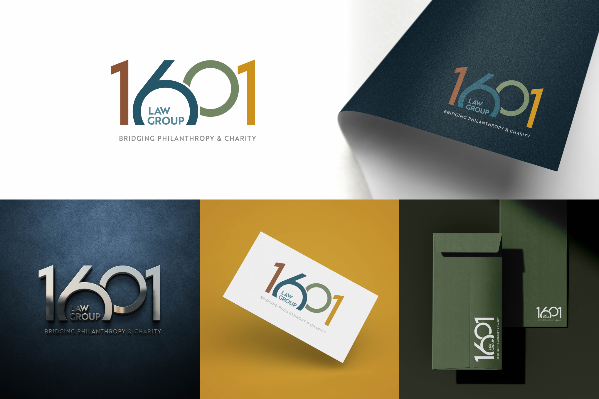
The design revolves around a numeric foundation, where the numbers 6 and 0 are positioned irregularly, overlapping to create intersecting circles. This intersection symbolizes the firm’s mission of bridging philanthropy and charity—representing the connection between giving and doing.
A classic sans-serif font was chosen for its subtle feminine touch because it is a women-owned firm.