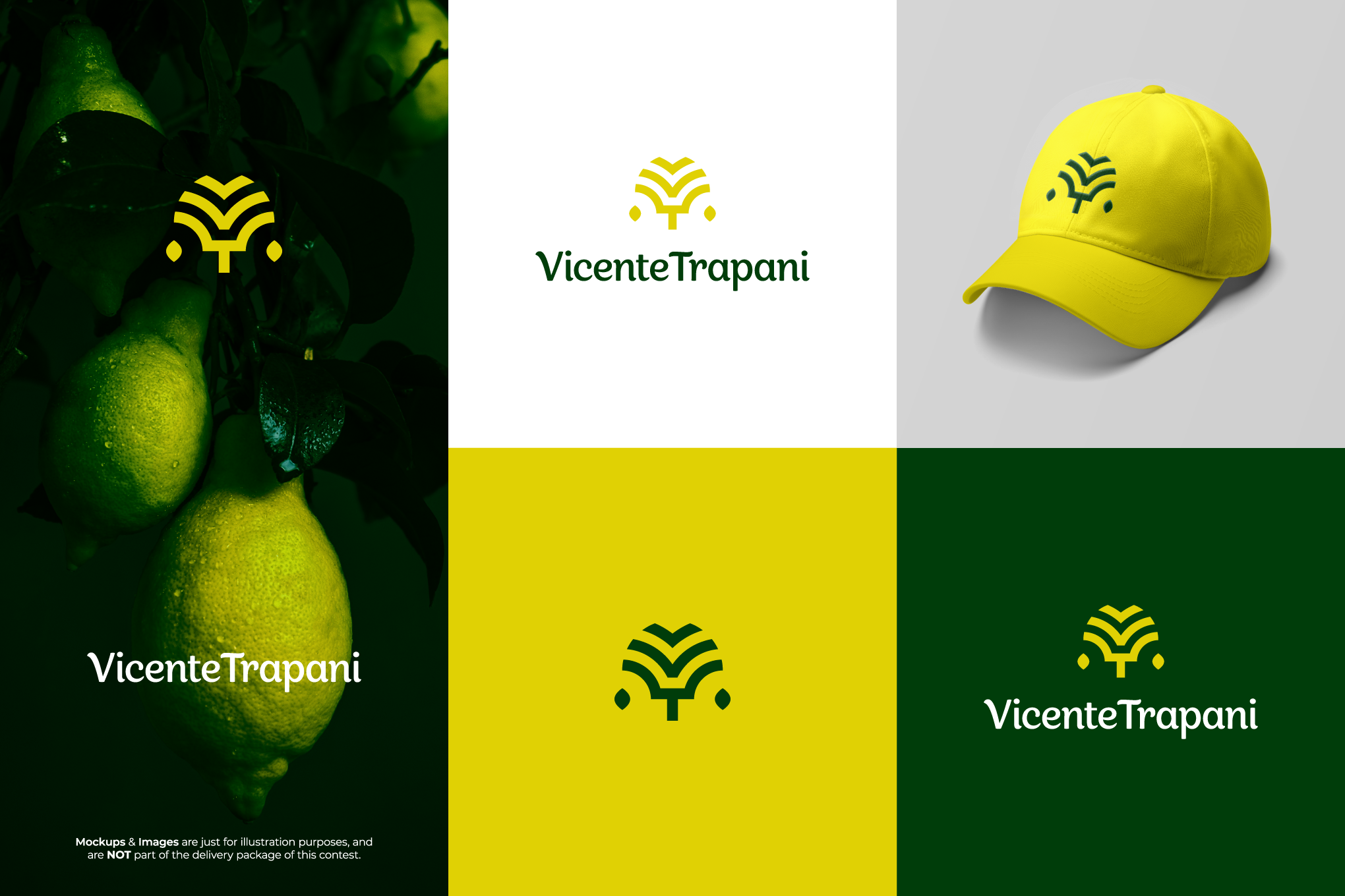
Vicente Trapani - Lemon Essence Oil Industry Logo Design

0
Created on 99designs by Vista
The idea is the vertical sum of the letters V (treetop center) and T (trunk/branch), with the lemon tree, plus two lateral lemons falling like "drops". There's also a bird at the top, as the company intends to repositioning the brand in the modern market - new flights.