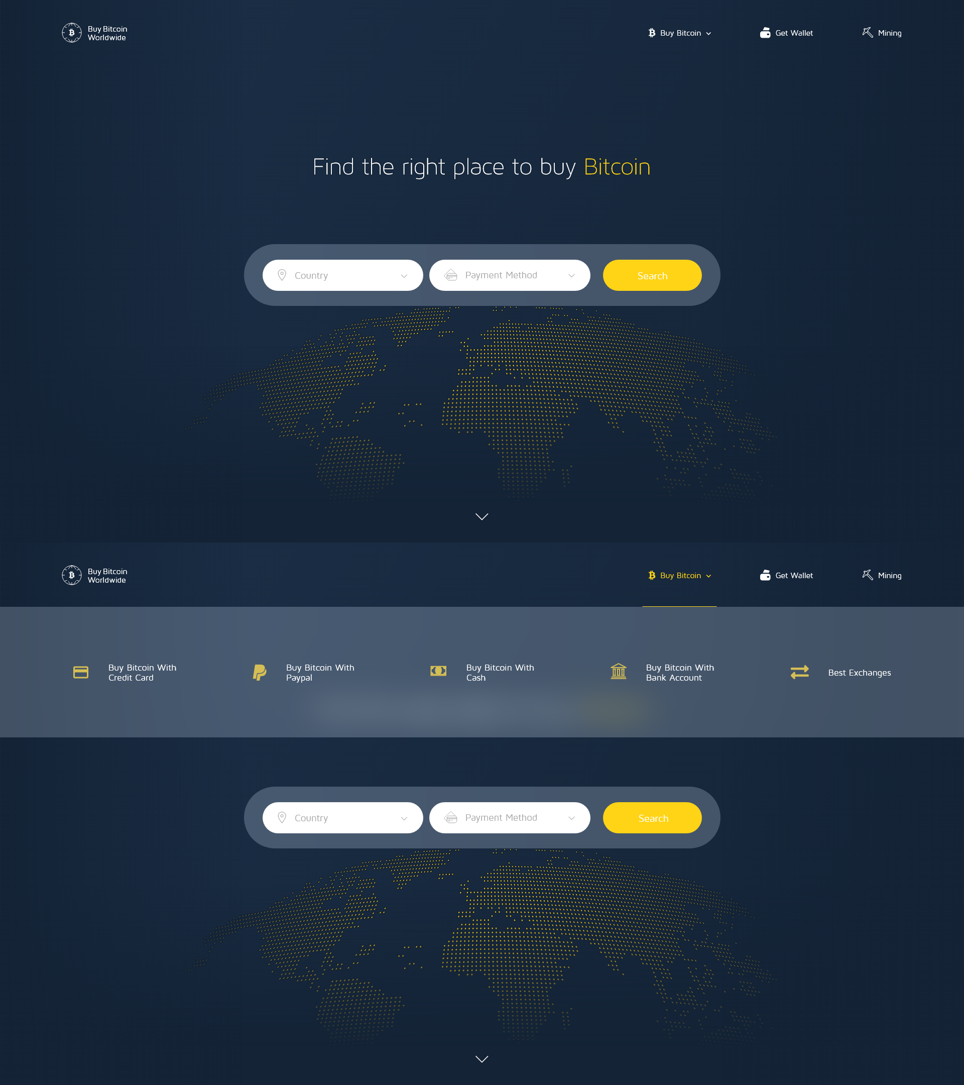
Hero Section Design For Buy Bitcoin Online
1
Created on 99designs by Vista
I used yellow and blue since it is the main colors of the company. I placed a doted yellow map at the bottom because the company operates worldwide and the yellow dots represents the bitcoin, so it means that bitcoin can be bought anywhere in the world. I tried to keep consistency throughout my design and just put the necessary to achieve a minimal look.
