Test Kit Packaging Design

1
Created on 99designs by Vista
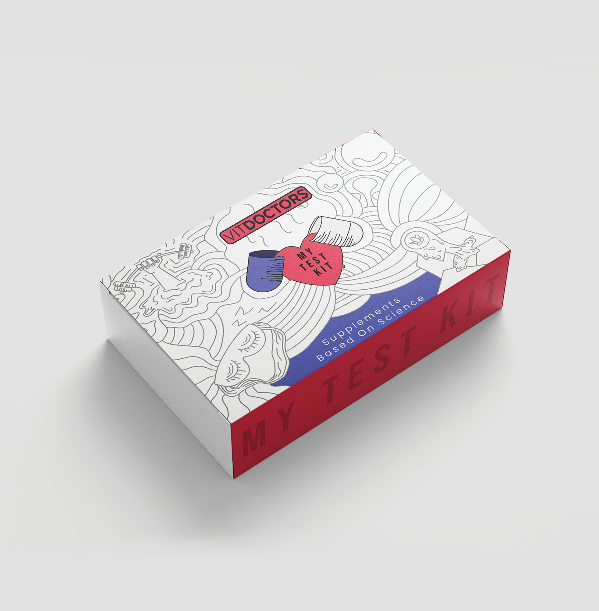
Problem:
1) Medical Facilities are scary which leads to unnecessary anxiety and this leads to dimnish experience.
2) When consumer visits the website and when customer recieves the kit they should be able to see the similarities so that a cohesive brand can be built.
Solution:
1) Make it Friendly while at the same time sticking to the Minimalist vibes I recieved from Using your Website.
2) Colors should be used in the same proportion and purpose as on the website
Ex: White- Primary colour
Red-Call to action/Focus
Blue-Secondary
Style:
This doodle style reduces the unnecessary anxiety factors by Implementing curves and repetitive figures
Colors are only used where attention is needed