
Created on 99designs by Vista
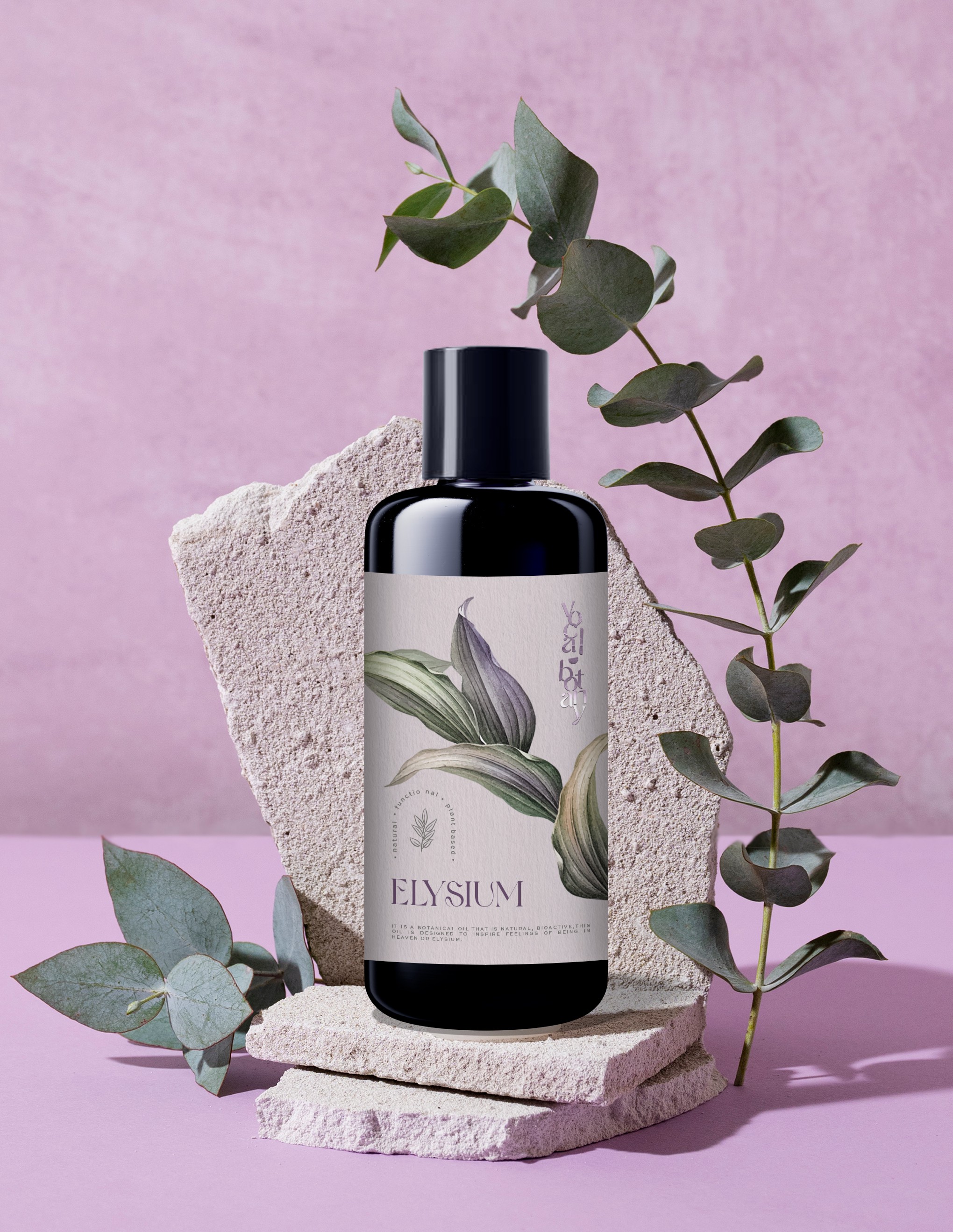
I aimed to create a design with a touch of botanical eeriness, instantly telling your customers that this product is all-natural and meant to pamper. I chose clean, delicate fonts and a versatile icon that not only highlights the product's benefits but also balances the layout. For colors, I suggested a soft blueish-purple as the primary color, paired with a soft green that complements the bottle perfectly.