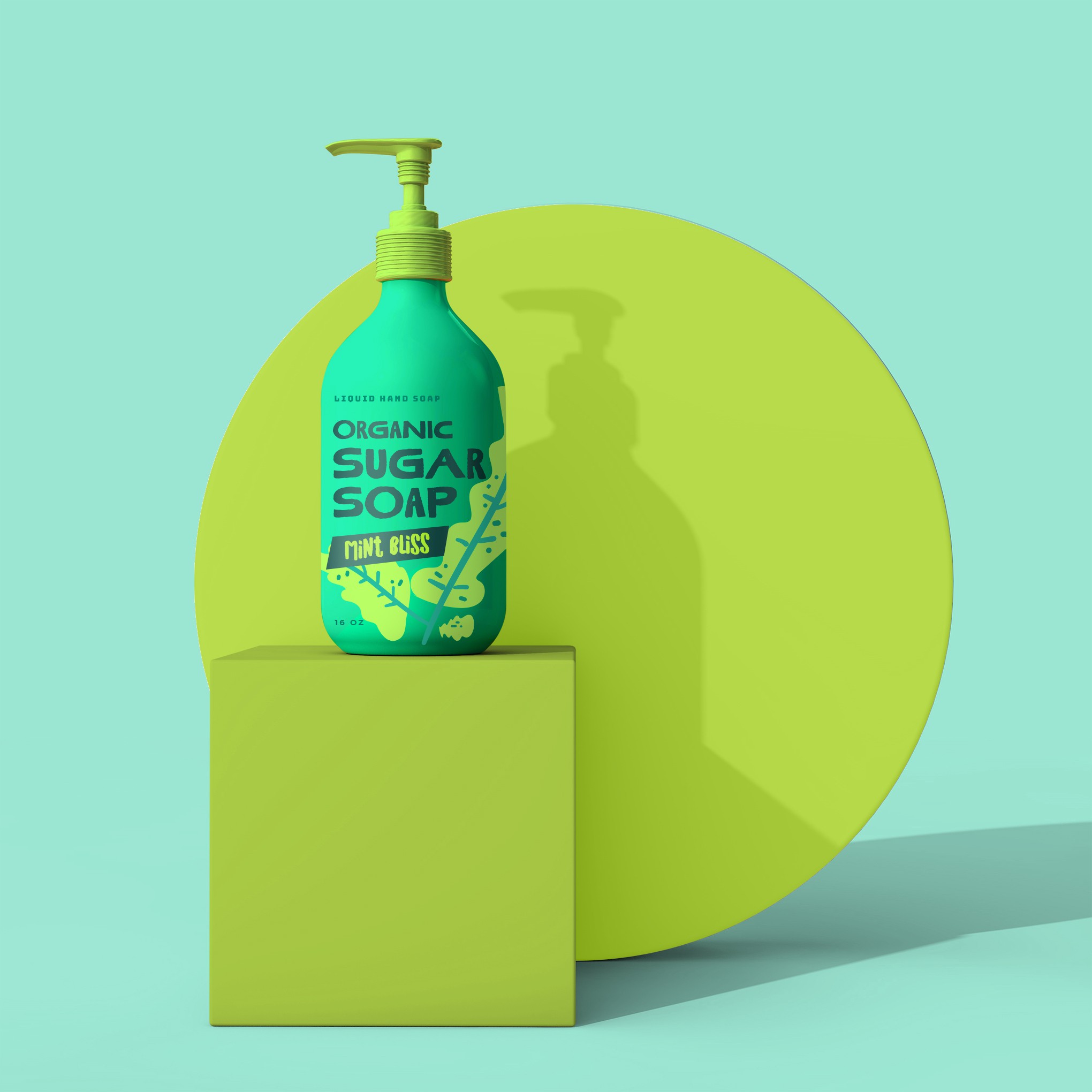

For the Organic Sugar Soap in the "Mint Bliss" scent, I've crafted a label that is bold, fun, and youthful, perfectly aligning with the brand's vision. The design is created to be iconic and eye-catching, ensuring the product stands out on the shelves.
The use of big, sans-serif fonts ensures the product name and scent are immediately visible and memorable. The text is designed to be easy to read and impactful, giving the label a modern and dynamic look.
The label features saturated colors that pop against the green 16oz bottle.
The layout is versatile, allowing for easy updates with new scents and colors. This adaptability ensures a consistent brand identity across different product lines, while still providing unique elements for each scent.