Modern logo for accounting business

3
Created on 99designs by Vista
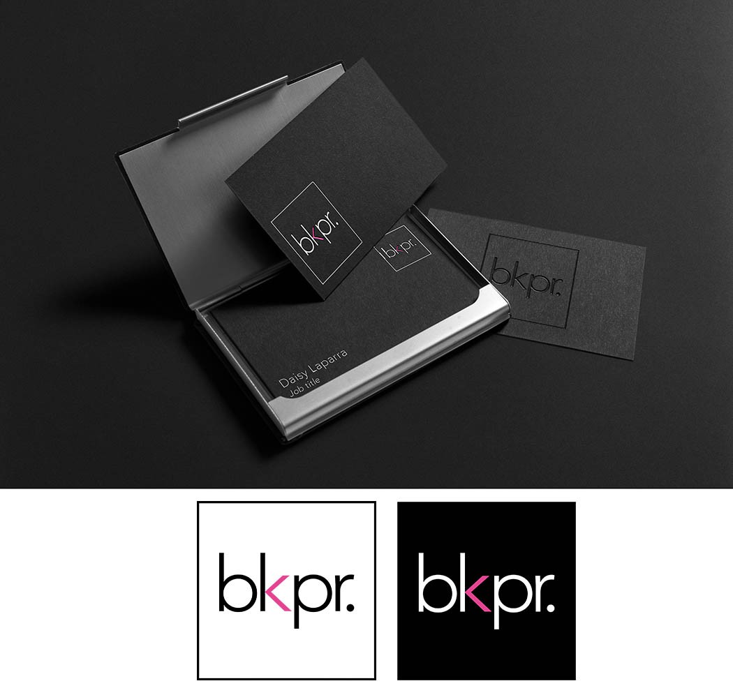
The logo is made with a sans-serif font and meant to look simple, yet classy so that it appeals to both males and females despite having pink (color requested by client). The use of black and white as main colors reinforce this gender-neutral objective. Part of the K is made to stand out in pink to look like the "less than" symbol. [Business card mockup just for example, not an official design.]