Tortuga's Retro Sandwich Logo Design

1
Created on 99designs by Vista
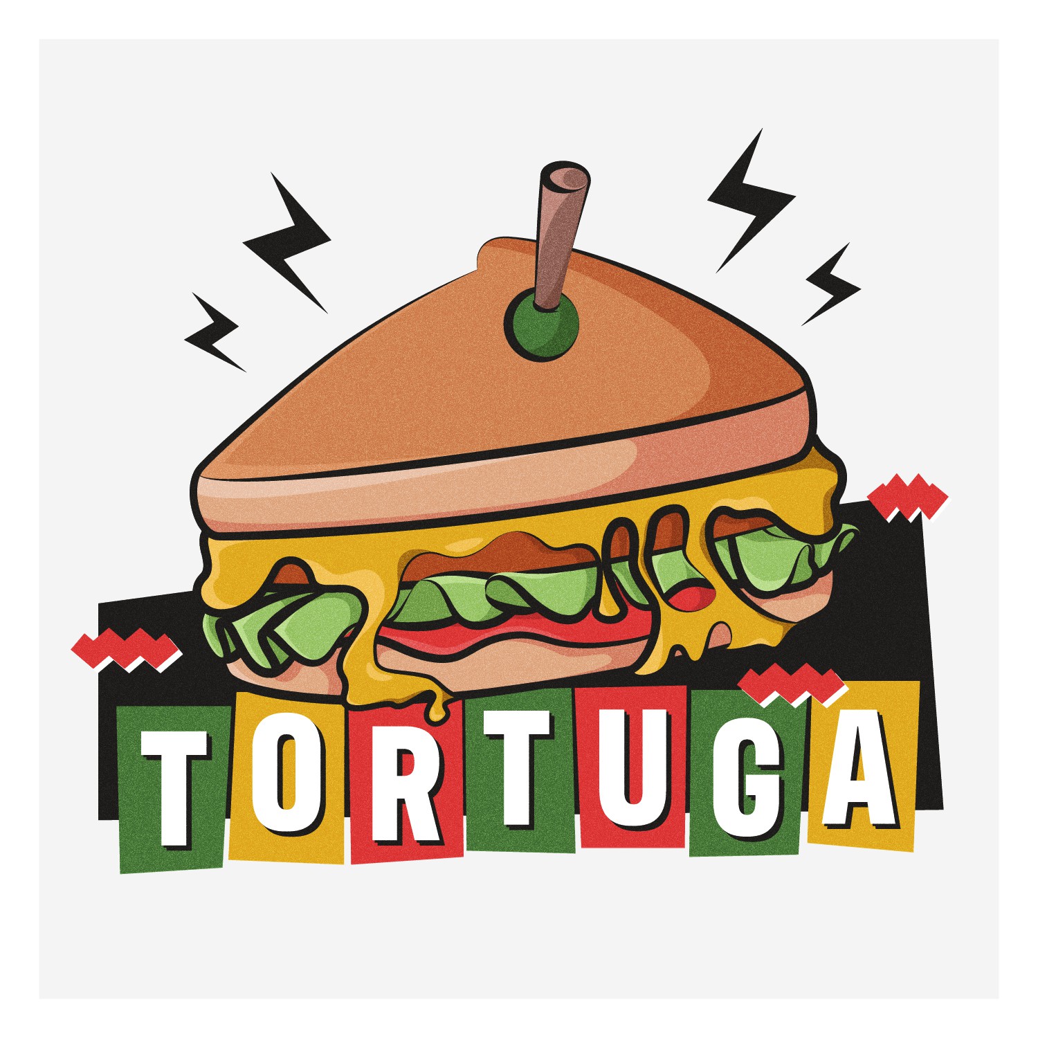
The logo features a sandwich in a retro 90s cartoonish style, giving it an old-school and edgy look that perfectly fits with Tortuga's branding. I've used a variation of less saturated colors, including brown, dark grey, yellow, green, and red, to create a playful and fun look while emphasizing the 90's aesthetic of the logo. The difference between this and the previous one is the application of gritty texture to the design to give a more funky and old-school vibe to it.To add to the bold and retro tone, I've chosen the sans serif font "Antarctican Headline Bold" for the typography. I believe this font perfectly complements the visual identity of Tortuga and will make your brand stand out.