Van Mechgelen Racing - Logo design

0
Created on 99designs by Vista
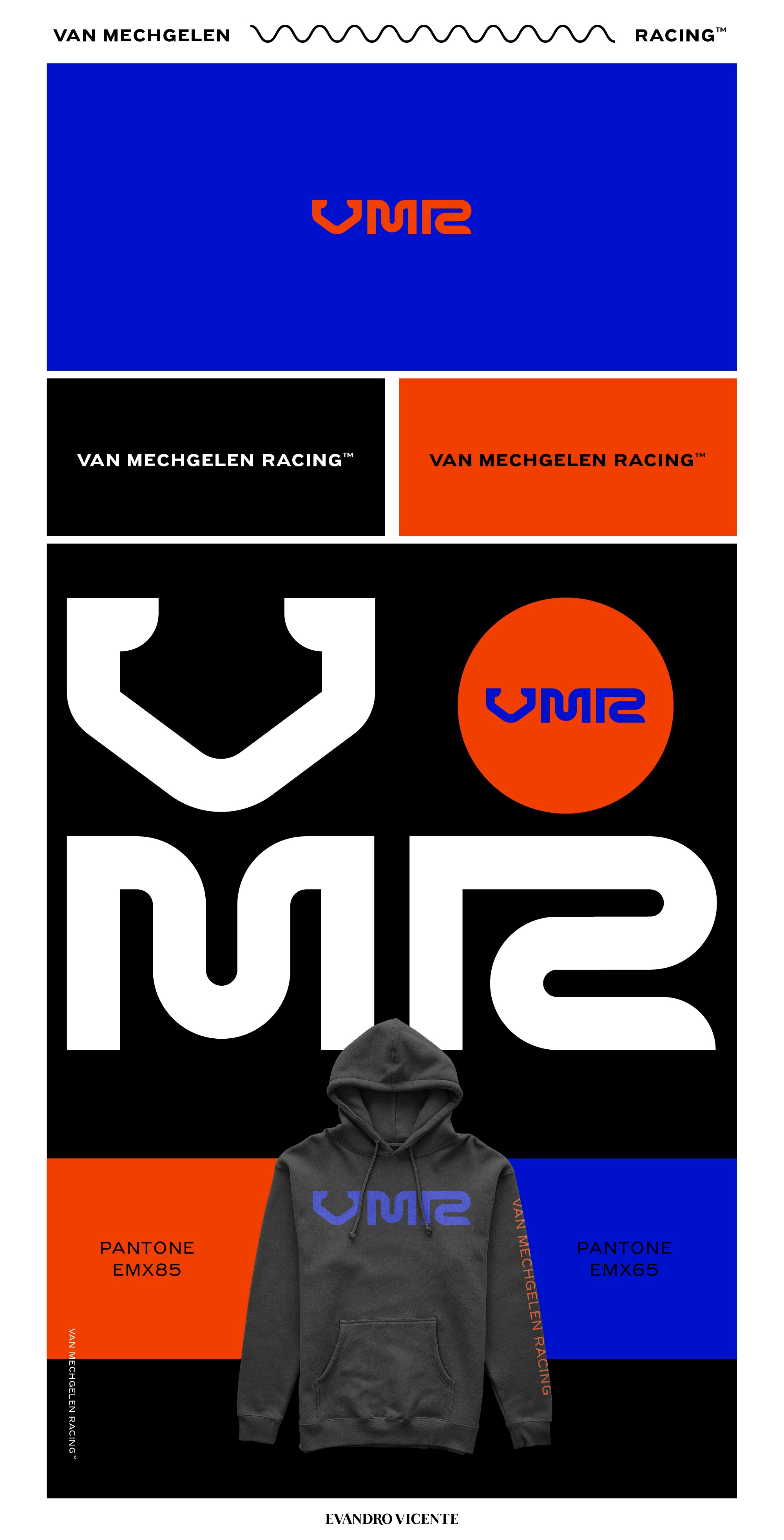
This is a logo redesign and the direction would be to change to the acronym VMR and the reason is very simple, strategic visibility with the other sponsoring brands. An example of this is the KTM group (One of the supporting brands).
In the creative part, each letter of the acronym was thought of in sport, racing, team leadership and a family tradition.
V - Reminds me a lot of motorcycle handlebars
M - Remember the ramps
A - Remember the curves of the slopes
(Can you see the number 2 in the R? It represents the Van Mechgelen brothers)