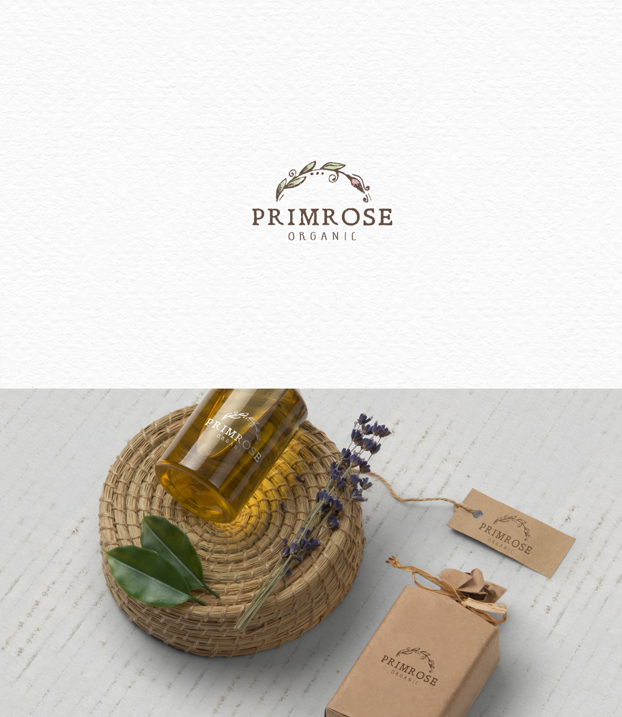
Logo for nature based body and beauty company

104
Created on 99designs by Vista
Logo design proposition for the cosmetic company that produces beauty and care products and is founded on the notion that nature has the solution for many of beauty and care questions. To cover those 2 main aspects - organic & natural ("nature that cures#) and the client request for diversity and un-dullness, I based my design on an organic look with a rustic feel to so that the design visually associates botanical drawings and old apothecary labels. This is achieved by combining a hand-drawn floral element with grungy details and font that matches the image style.