
Created on 99designs by Vista
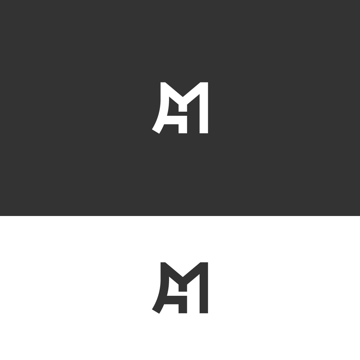
The main concept of this logo combines the initials of the letters Д (boyfriend) and M (girlfriend), where the letter Д which represents a man is made in a minimalist abstract style in the form of a man kneeling facing to the right while holding the hand of a woman (letter M). The letter M is made in an abstract style like a woman standing facing left. So this logo combination can visually communicate your tagline, namely: "Actions speak louder than words".
This logo uses a black and white color scheme because this color has a neutral impression so this product will be suitable for use by all genders and all ages.