
Created on 99designs by Vista
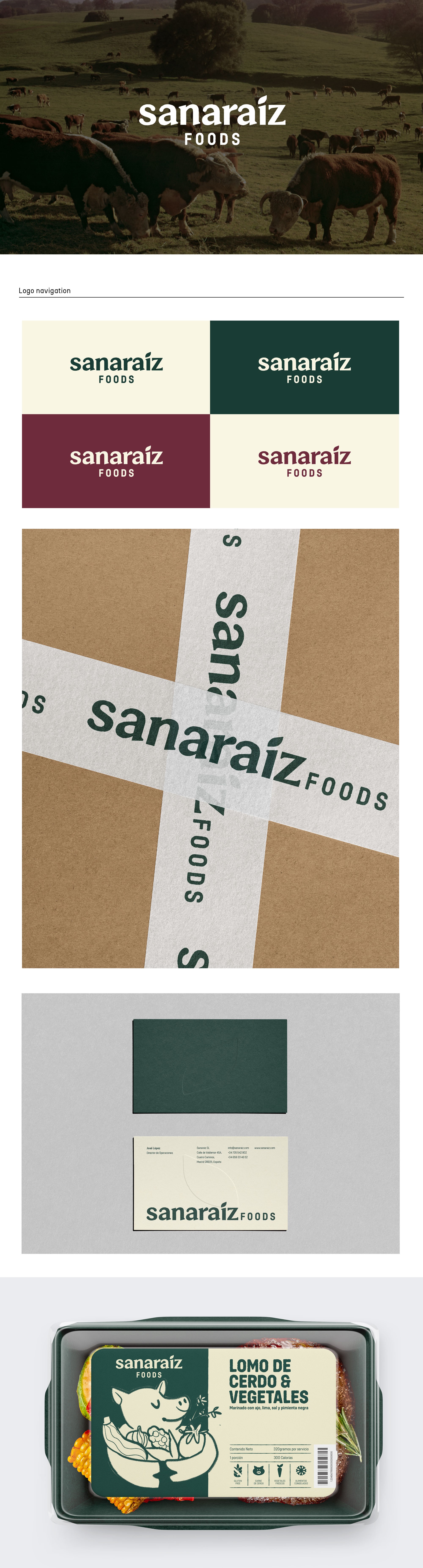
Sanariaz brand identity is built around a simple yet distinctive wordmark, featuring irregularly stylized edges that give it an artisanal and authentic character. A key design element is the integration of a leaf into the letter "I," serving as a strong and clear visual representation of the brand’s commitment to natural and healthy food.
This concept was developed to seamlessly blend with creative elements, whether illustrated or photographic, always incorporating a touch of humour.