
Created on 99designs by Vista
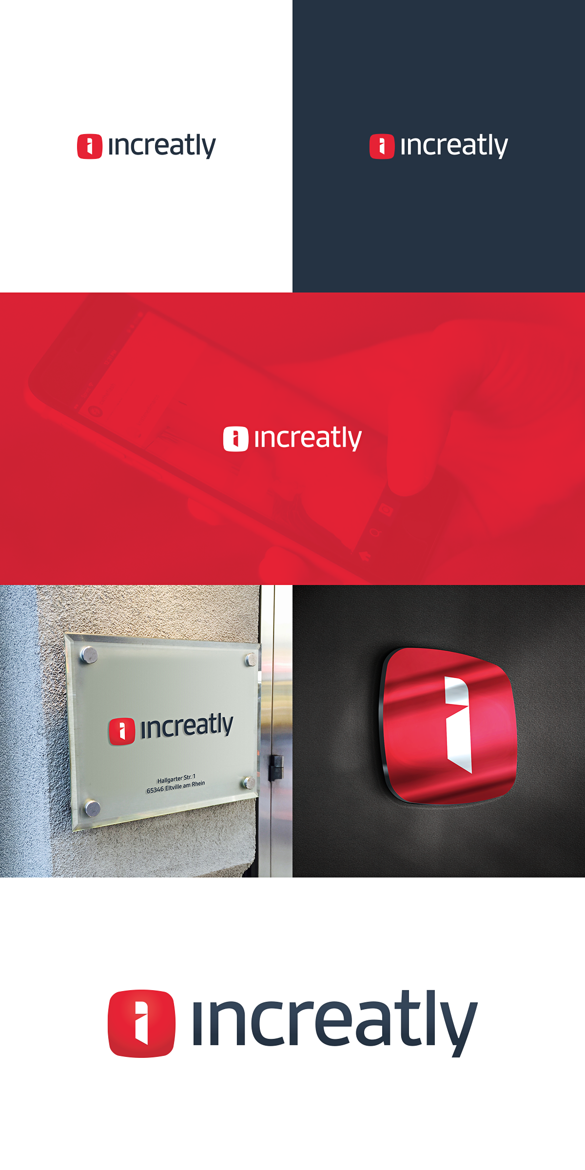
The logo is based on a stylized 'i' inside of a shape of expanding app icon. The 'i' monogram resembles a door opening - an entrance into the world of apps for company's clients.
The logo is slightly reserved due to current major clients being in a relatively conservative financial sector.