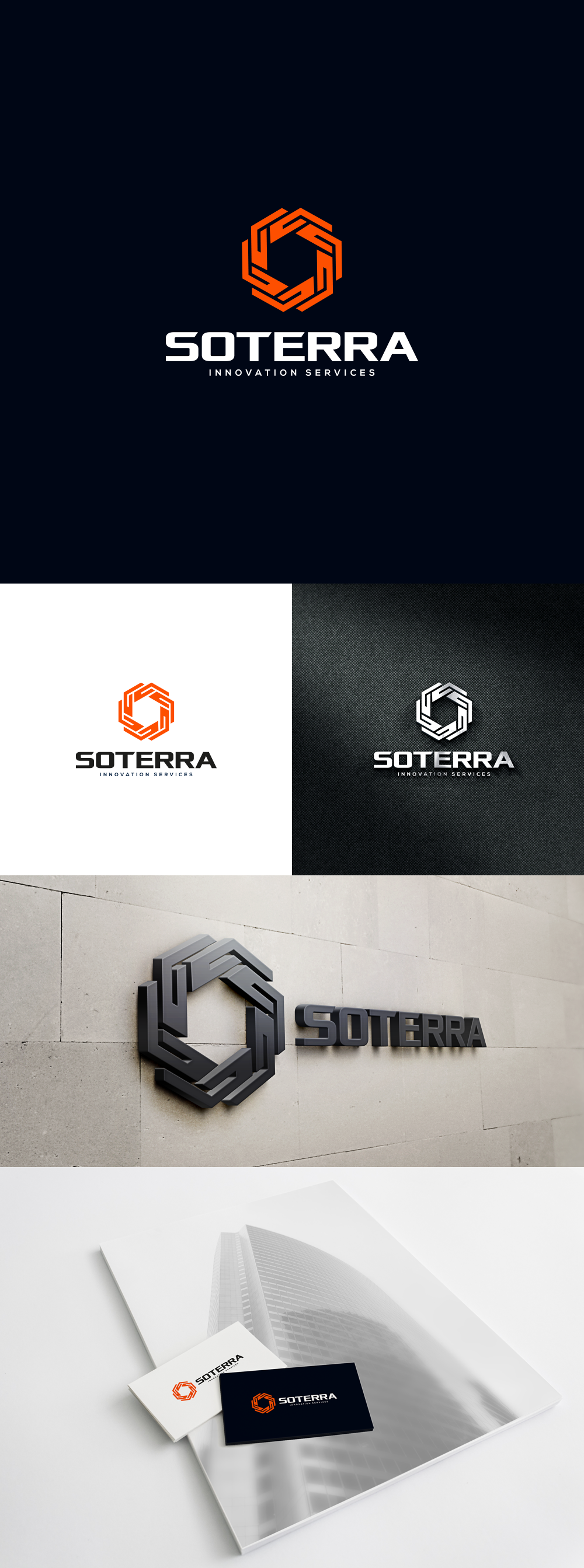
Bold logo in corporate style for company managing industrial patents

242
Created on 99designs by Vista
I was inspired by classical corporate style for the mark but with customized high-tech typography, since that was a requirement and logical choice considering the industry branch.
If you look at an individual element that forms the mark, it is also an abstraction of hand ("holding" the rights) but the overall shape is interlocked which represents the patents being secured and the whole process taken care of in one place. It also suggests rotational movement (the INNOVATION).
The way or style in which this is all shaped is very precise and symmetrical - as technology in fact is.