
Created on 99designs by Vista
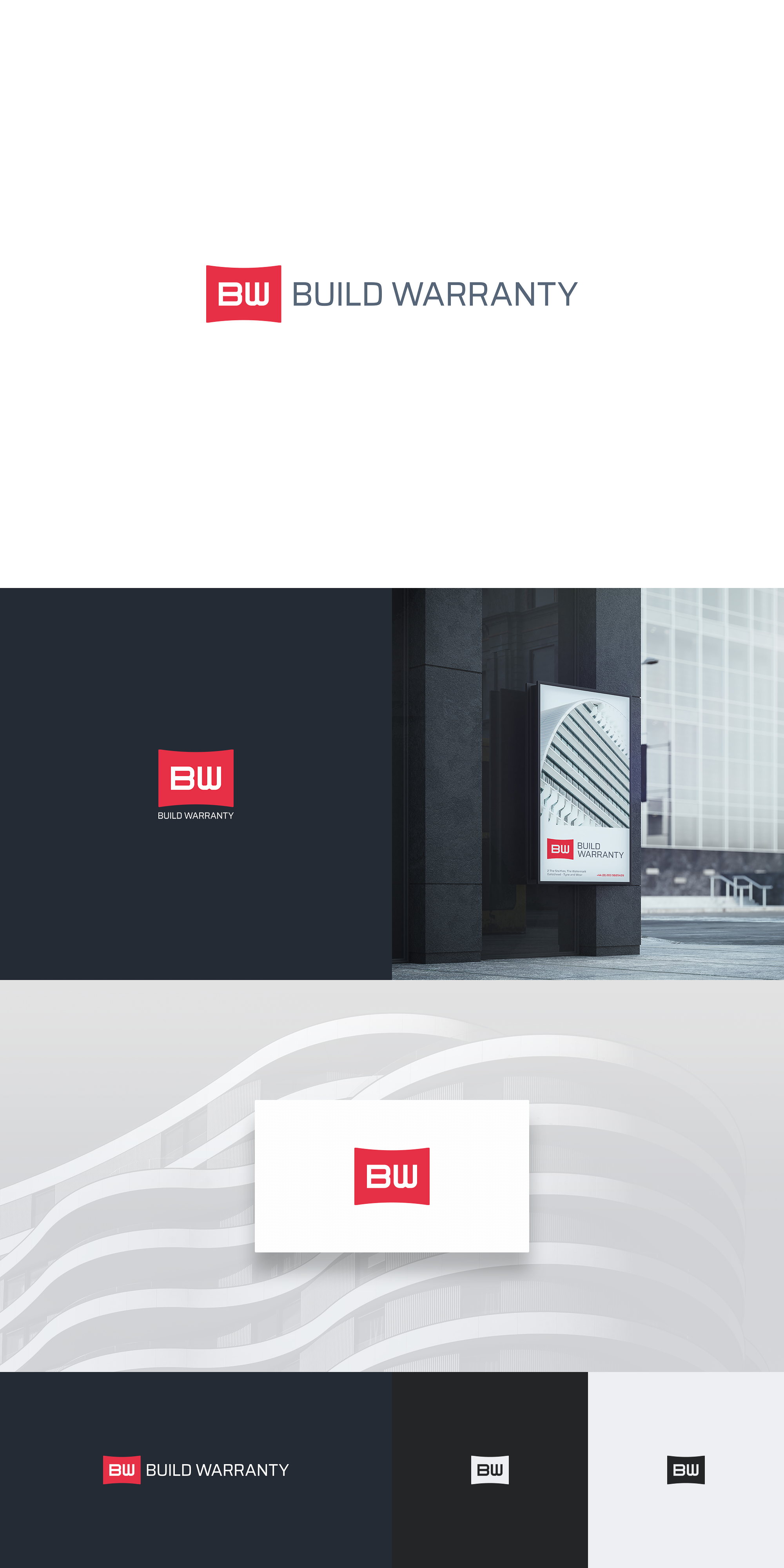
A fully bespoke mark, particularly constructed with intention to stylistically reflect the industries involved (construction/development and insurance).
Both letters share the exact same foundation - except obviously for rotation and an extra vertical on B - in order to appear highly uniform and consistent.
The accent color container for the initials is very important here as it solidifies the logo against anything around it (crucial when used in isolation as well) and provides a much sharper contrast as well. Curvature on top and the bottom soften the rigidity and imply the modern architectural touch.
The logo is flexible enough to work in a variety of layouts and color arrangements, including pure black and white.