
Created on 99designs by Vista
While present on the Canadian market for a while, this construction services company required a brand new mark that could confidently represent the quality they are able to provide. Hence I was approached to produce a unique, modern and precisely tailored wordmark from scratch.
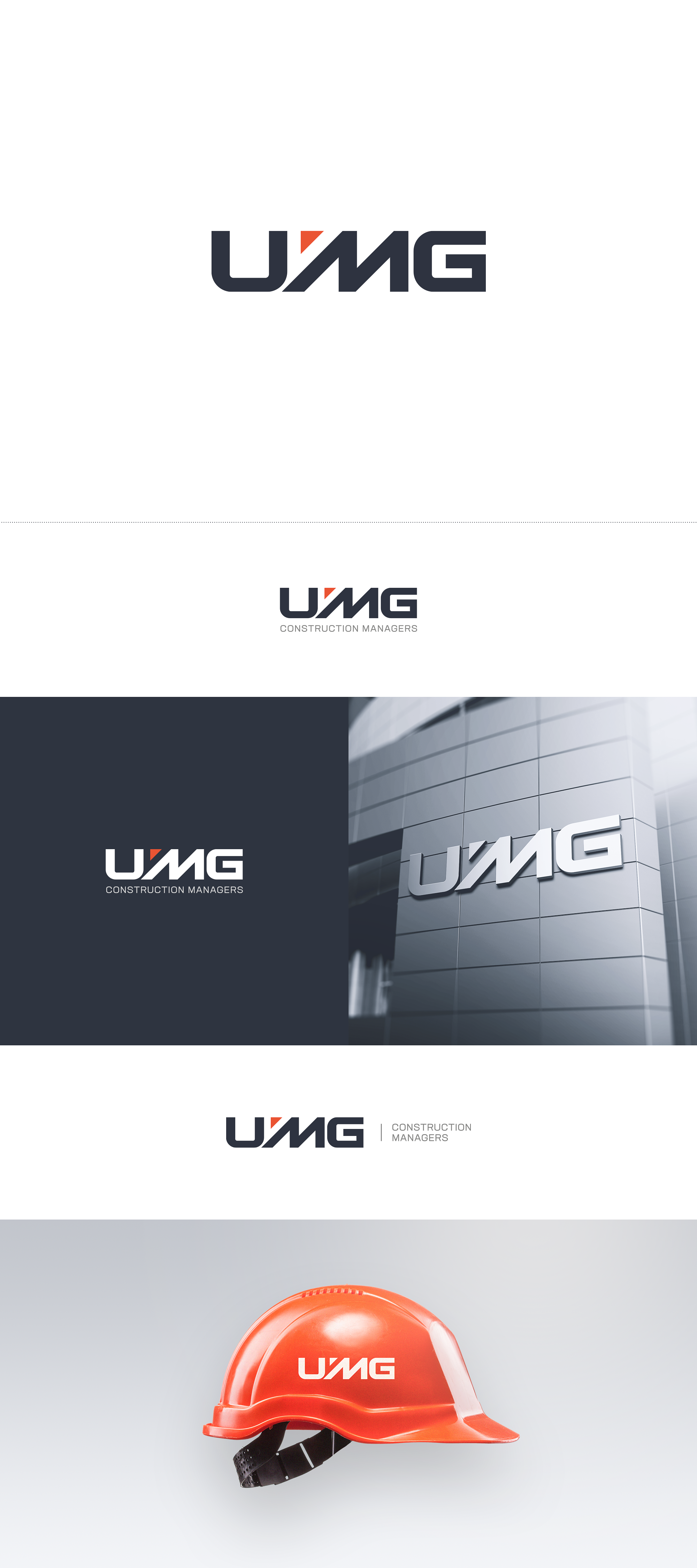
The central M letter was intentionally shaped to emphasize diagonals as an abstraction of recognizable architectural elements.
Triangle carrying orange accent is not there to merely fill the gap, but to add to the symbolism in two distinct ways: a) together with the left half of the M it creates a stencil-like arrow directing top right, and b) the entire mark appears as an outline of an urban planning blueprint.