
Created on 99designs by Vista
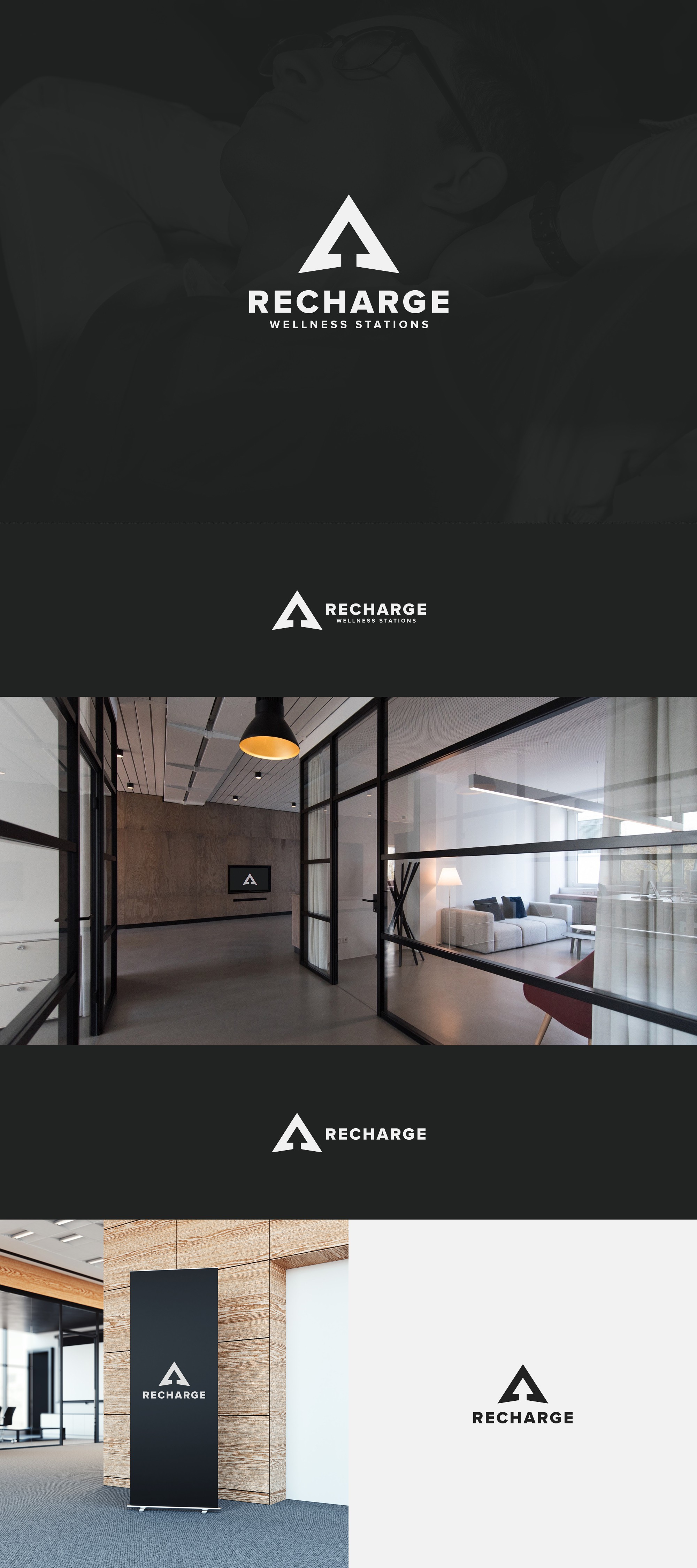
The original logo featured a simple chevron design which required something extra to make it more specific and related to the service provided by this Toronto based company. At the same time, these mobile onsite recharging wellness stations also need to blend in with their surrounding, whichever companies' offices they're set up in.
The result is bold and striking yet retains a certain neutral appearance that won't feel out of place at any corporate space.