
Created on 99designs by Vista
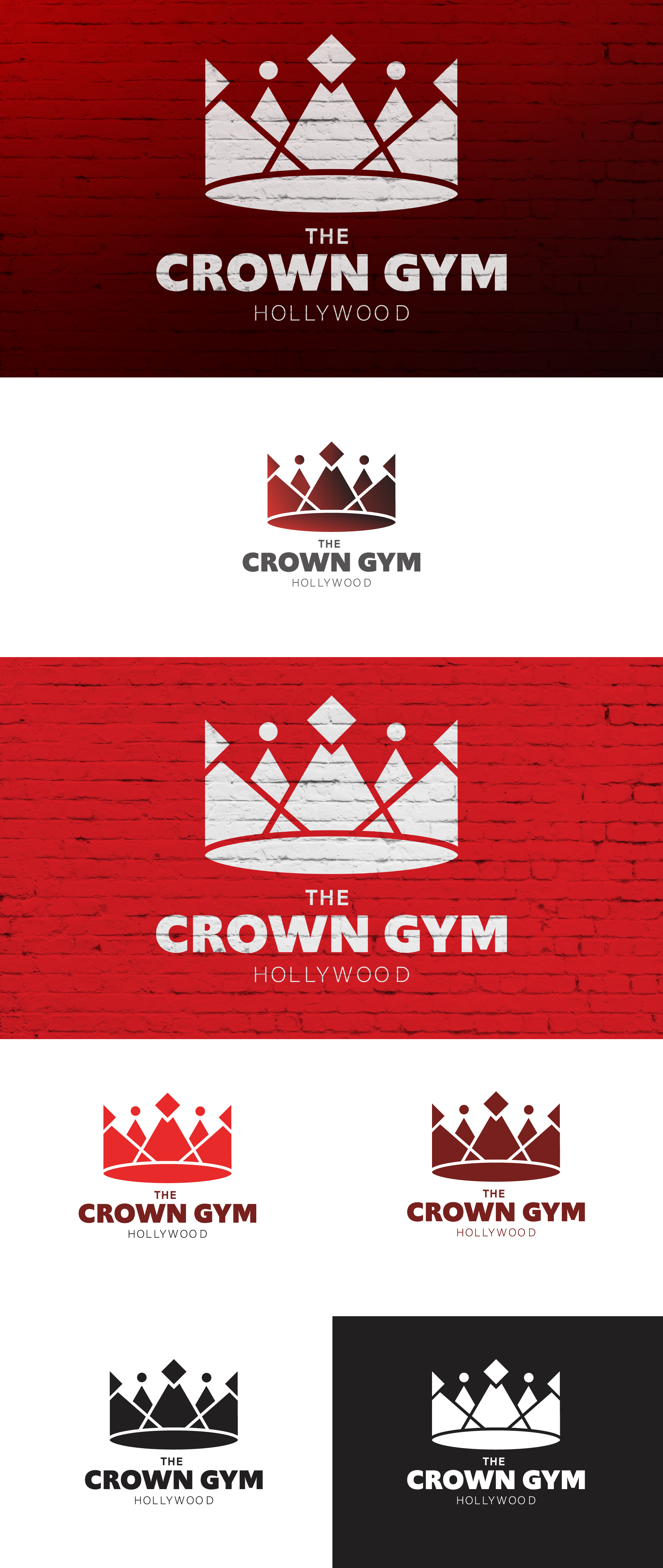
- I created a geometric crown icon with some familiar shapes, but organized in a new way.
- The negative space (white gaps) in the crown allowing your eye explore and flow through the design
- The gradient adds some dimension and drama.
- The thick sans serif font implies that this place tough
- The dichotomy between the delicate crown and the strong type, adds intrigue to those who see the ads.