Tobii Human Resource Solutions

1
Created on 99designs by Vista
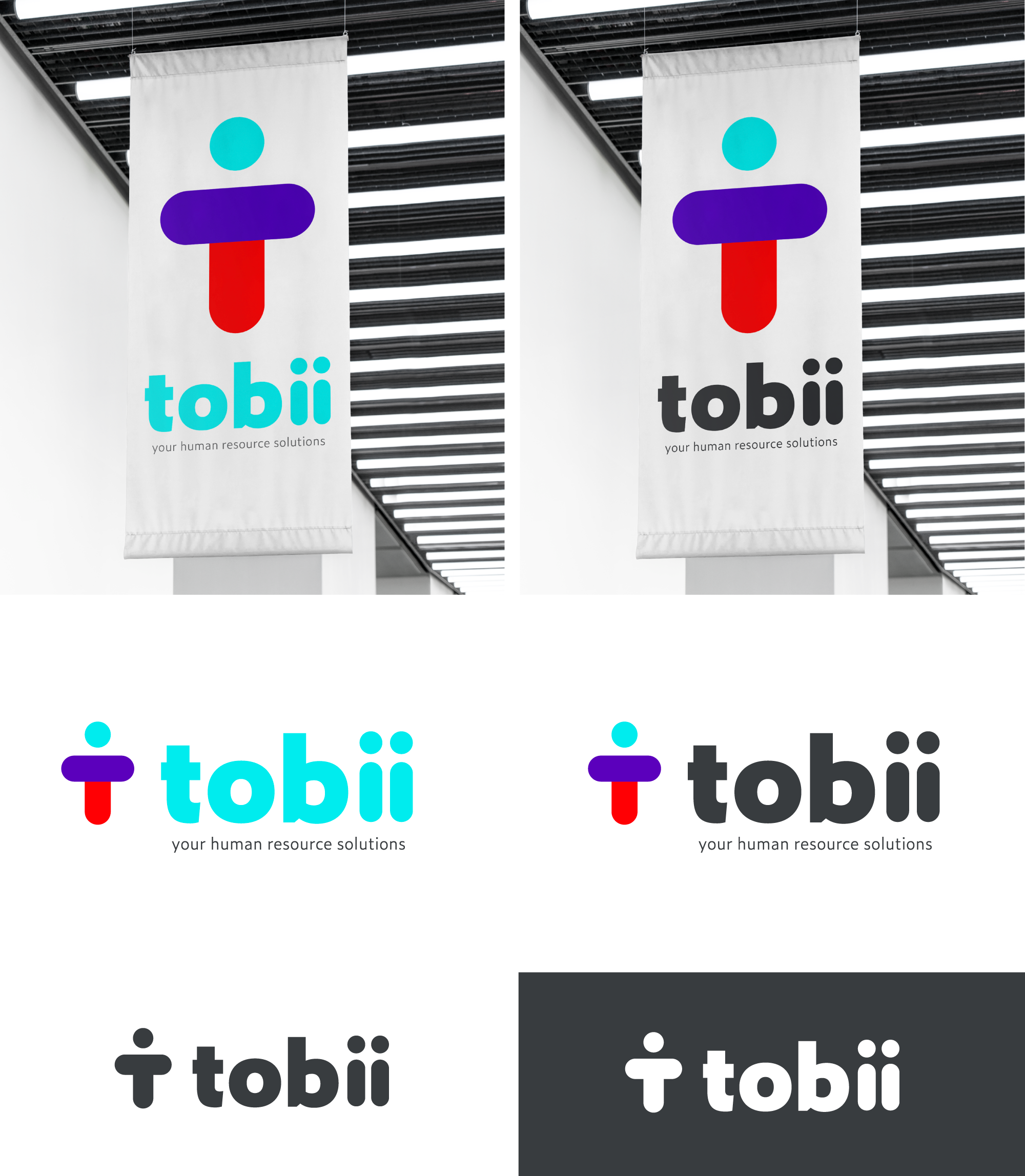
- The icon is a lower-case "t" for tobii and a silhouette of a human... a subtle nod to human resources
- The logo is friendly, simple, clean and clever; like it belongs in Silicon Valley
- The colors are fresh and progressive
- The font is bold and easy to read
- I added a little tag line but we can go without it as well