Creative logo design for a supermarket

0
Created on 99designs by Vista
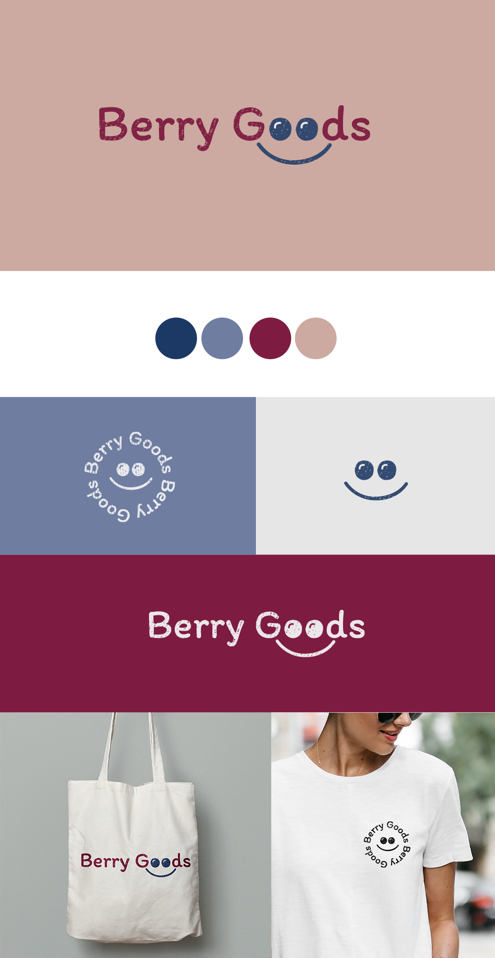
To create the brand identity for Berry Goods I first analyzed the main needs with the following keywords: trust, friendliness, natural food, organic, spontaneous and eye-catching. An effective logo should be simple and easy to remember, that is why, combining the essence of the brand, I chose a friendly font that would join with the idea of "very good" and "berry goods" including two berries in the letters "o" of good that at the same time are the eyes of a happy face that represents the idea of kindness, happiness and that everything is fine. A logo that can be simplified to its minimum expression, ideal for effective communication in all brand presentations. Without a doubt a memorable logo that will attract the attention of anyone