Elegant logo for hotel

0
Created on 99designs by Vista
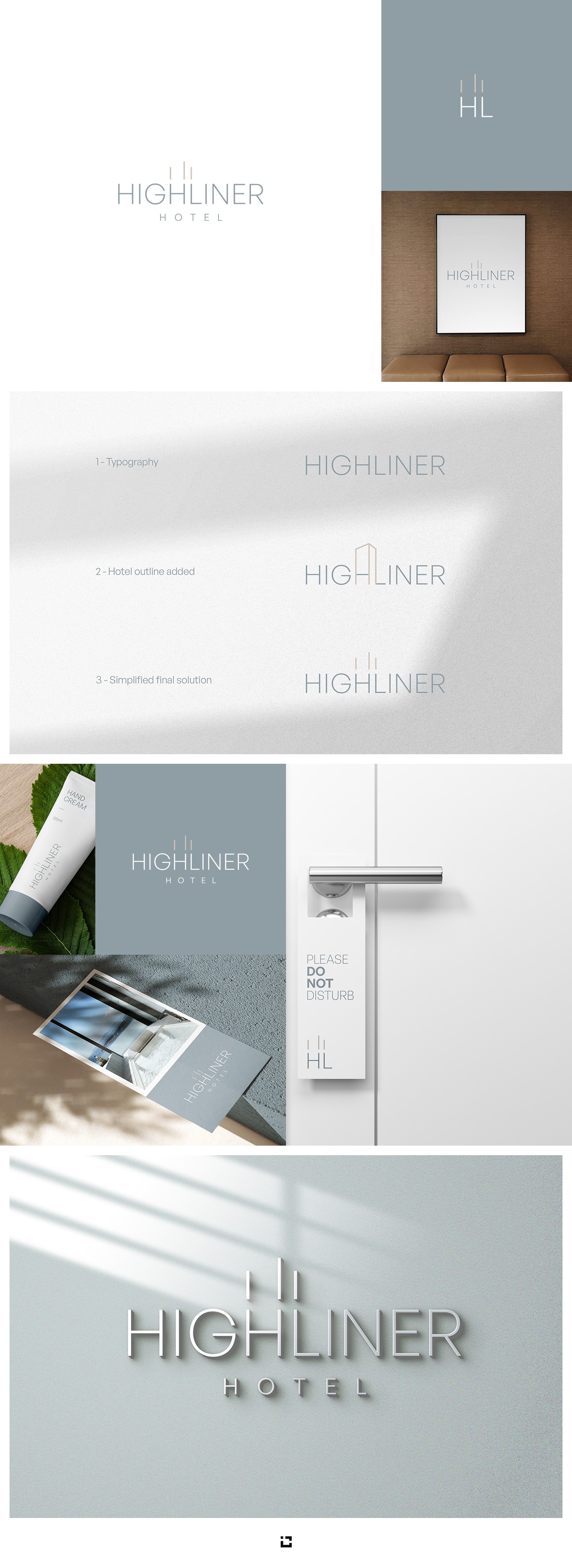
Another challenging contest, rebranding for Westcoast Beach hotel and conference center. The main target group is business clients. Three lines above the title symbolize the simplified construction of the hotel building. My idea was to make it simple, elegant, professional, with a touch of luxury. In addition to the main version of the logo, there is also a shortened version HL, which can be used when it is not possible to use the main, or when it is necessary to get a cleaner minimalist composition.