Flora Soda Can Design

10
Created on 99designs by Vista
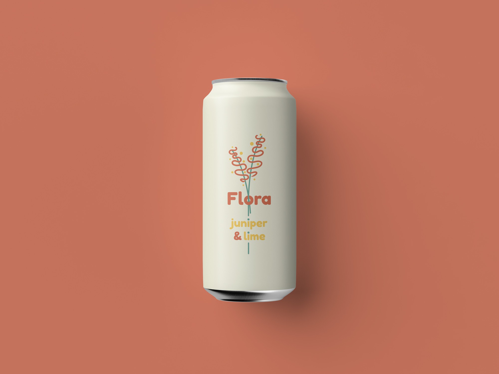
Simple, yet playful and young design for a soda can. The objectives were: slightly minimal design, incorporating a flower and attractive for young people.
I came up with a simple and beautiful flower design, interlacing through the brand name "Flora", and used the branch elements as part of the flavor subtitle. I picked a clean, well-contrasted and vibrant color palette on a light background.