Hawaiian theme for tropically inspired clothing

2
Created on 99designs by Vista
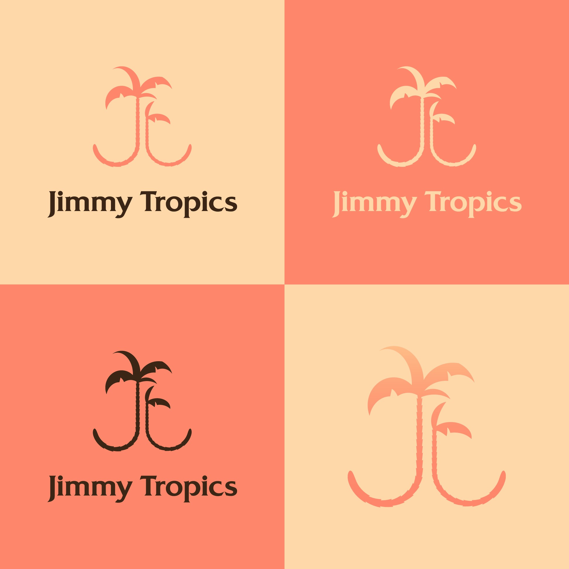
I love the vibe of the reference logo uploaded to the design brief, and that Hawaiian sunset color palette of those vivid creams and mangoes.
I kept coming back to the idea of 'jt' as two stylized palms, and turned those sketches into clean vector art which will lend itself to embroidery, letterpress printing, burning/branding, and multi-color printing.
I added some color variants, a version without the wordmark (a funky latin-style serif with triangular features), and included a gradient which will look great on a t-shirt.