
I scrutinized the design brief for a while before I started sketching things out, and I was intrigued by the desire to not have 'plant-based' be the marketing linchpin for their pop-up (which I hope becomes permanent).
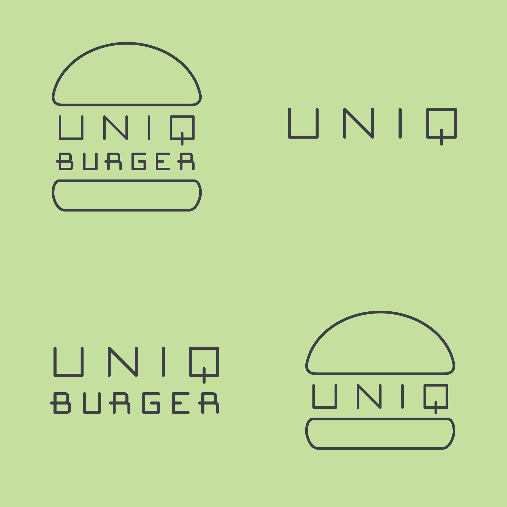
What I settled with was a new 'uniq' typeface for them. I wanted to make a modern, mono-line, san serif font that has design elements from classic diner signage (as food trucks are the new normal in casual dining).
The B and R's have crossbars that cross the stem, evoking a 50's-era streamline trailer lettering and hand-painted diner signage. I loved making this type, and may develop it into a full alphabet font called 'cyber cafe' or something :)
The bun is just cute, and let's people see from a thousand feet what they're selling and what they can expect. I matched the thickness of the letters for a web-friendly mono-line effect.