
Created on 99designs by Vista
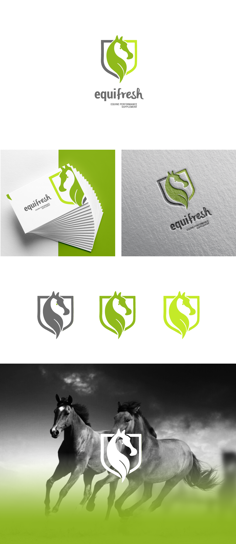
I made this logo based on the sprout of sprouted barley and a horse that is born from it, contained in a shield referring to horse races, so that the reference to the races and winning horses can be seen for providing them with this food.
Syntactically, simple shapes and full colors make it modern and fresh at the same time.
The chosen typography shows this double sense of strength and fresh and healthy food.