
Created on 99designs by Vista
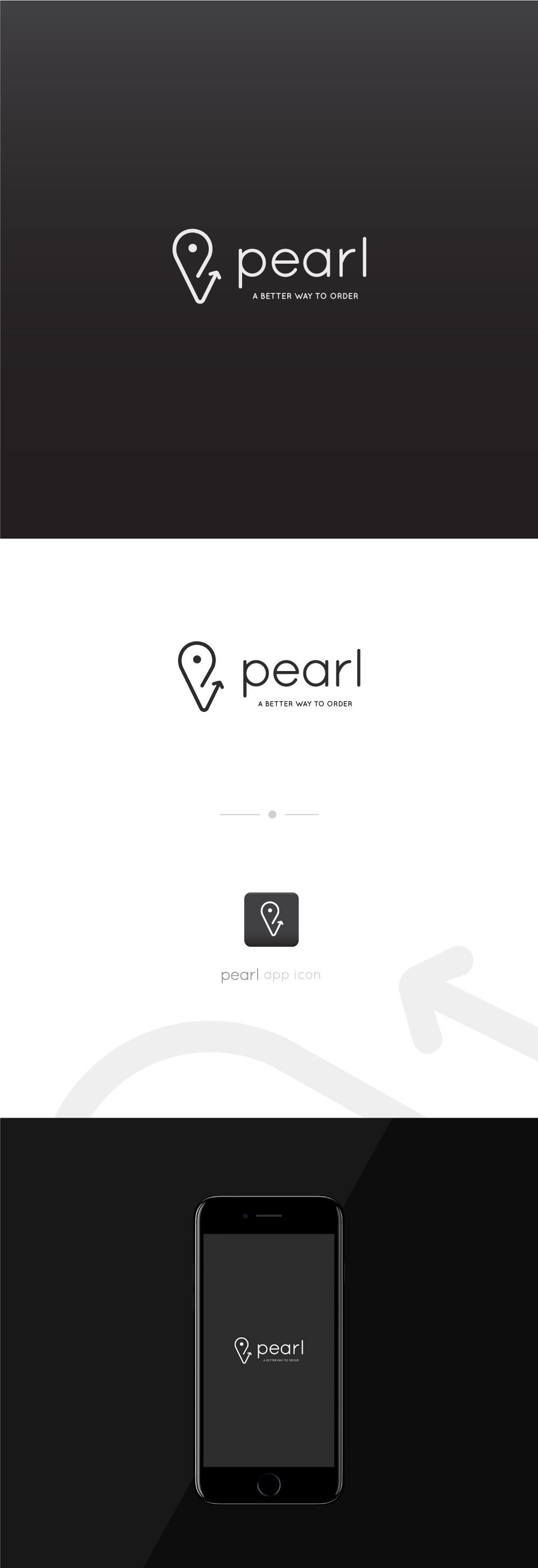
For the realization of this logo, I worked with the location sign, that becomes an arrow referring to a way (this ends by indicating PEARL as the best option).
With it it contains a pearl, synonymous of quality, symbolizing the plus quality in the service.
The color and typography are chosen to represent something modern and dynamic, being both formal and prestigious.