
Created on 99designs by Vista
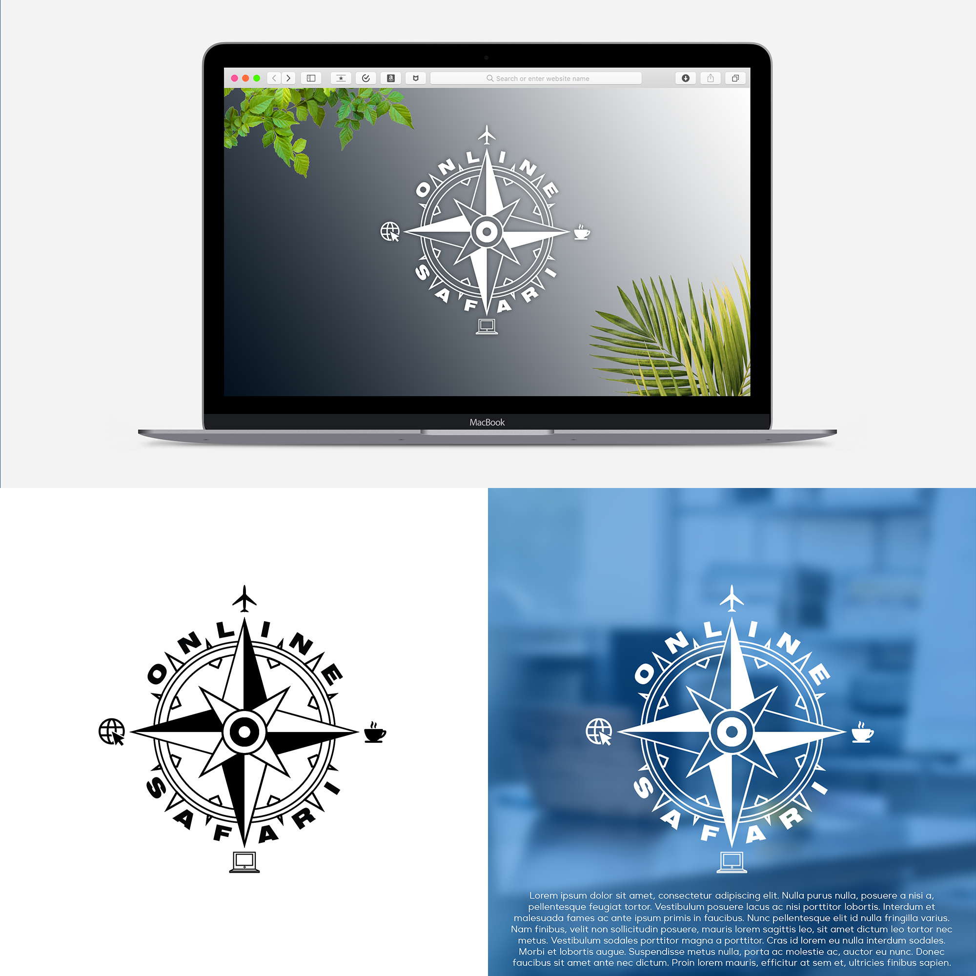
I have read again your Brief and decided simply to realize your idea cuz it seems really cool. I like that letters fit well around this compass. But only thing I changed are icon places. I think it fits better in the corners. Compass like shows different directions. Like North is a place or west is internet. Hope you will like it)