4bs Print Bag Concept

3
Created on 99designs by Vista
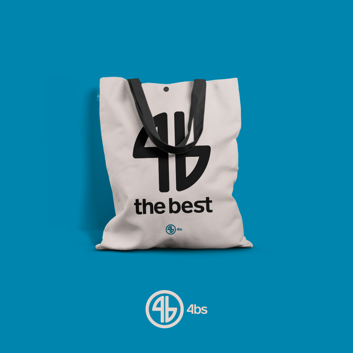
Dina was launching a brand of clothes for all ages and genders. She also said that she like simplicity so, with a little bit of symbolism, her came up with the idea of fish that goes back to the brand name, something that she said had a lot of connection with her, that is, the names of her 4 children start with the letter B, so 4b. There is also the circle, which refers to a cycle that has no end, because it literally has no ends. And the font used was entirely stylized for her logo.
The colors, refer to the beach, which living on Long Island, I believe is part of her life.