
Created on 99designs by Vista
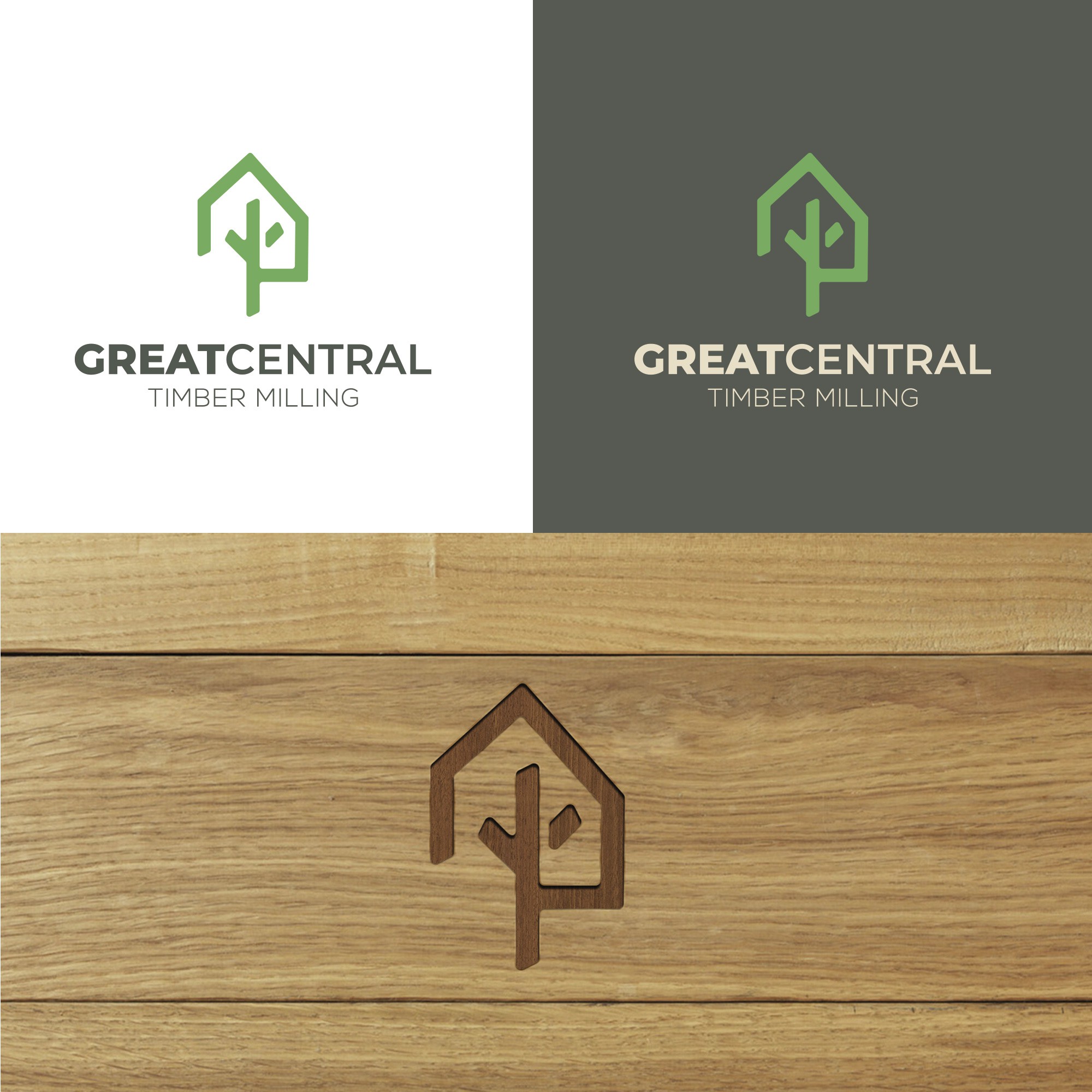
The main activity of the company is making timber frames for construction so, abstractly, I used a tree form inside a building structure. An easily remembered logo, with rounded edges and a slight asymmetry to give a softer and more unique look. The color palette was previously selected by the client, and I chose the shades of green that I personally find more visual appealing. The symbol itself works very well alone.