
Created on 99designs by Vista
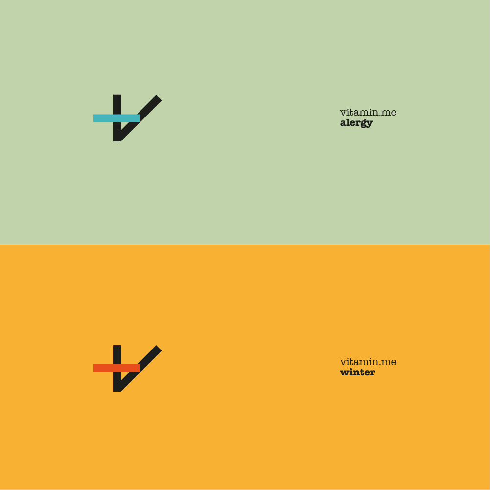
In a boring market, that most of its brandings lean-to green and blue colors with thin type and white background, I think it's time for something else. Bold color combinations, mature and self-confidente package, and most of all, sharp and refreshing icon, that combines the letter V, "+" sign and plaster. The icon is very recognizable and adjusts to the vitamin.me sub-categories by switching colors. Together, the exiting colors, the unique typographic and the stunning icon create very different, very adjustable and very new health brands.