Created on 99designs by Vista
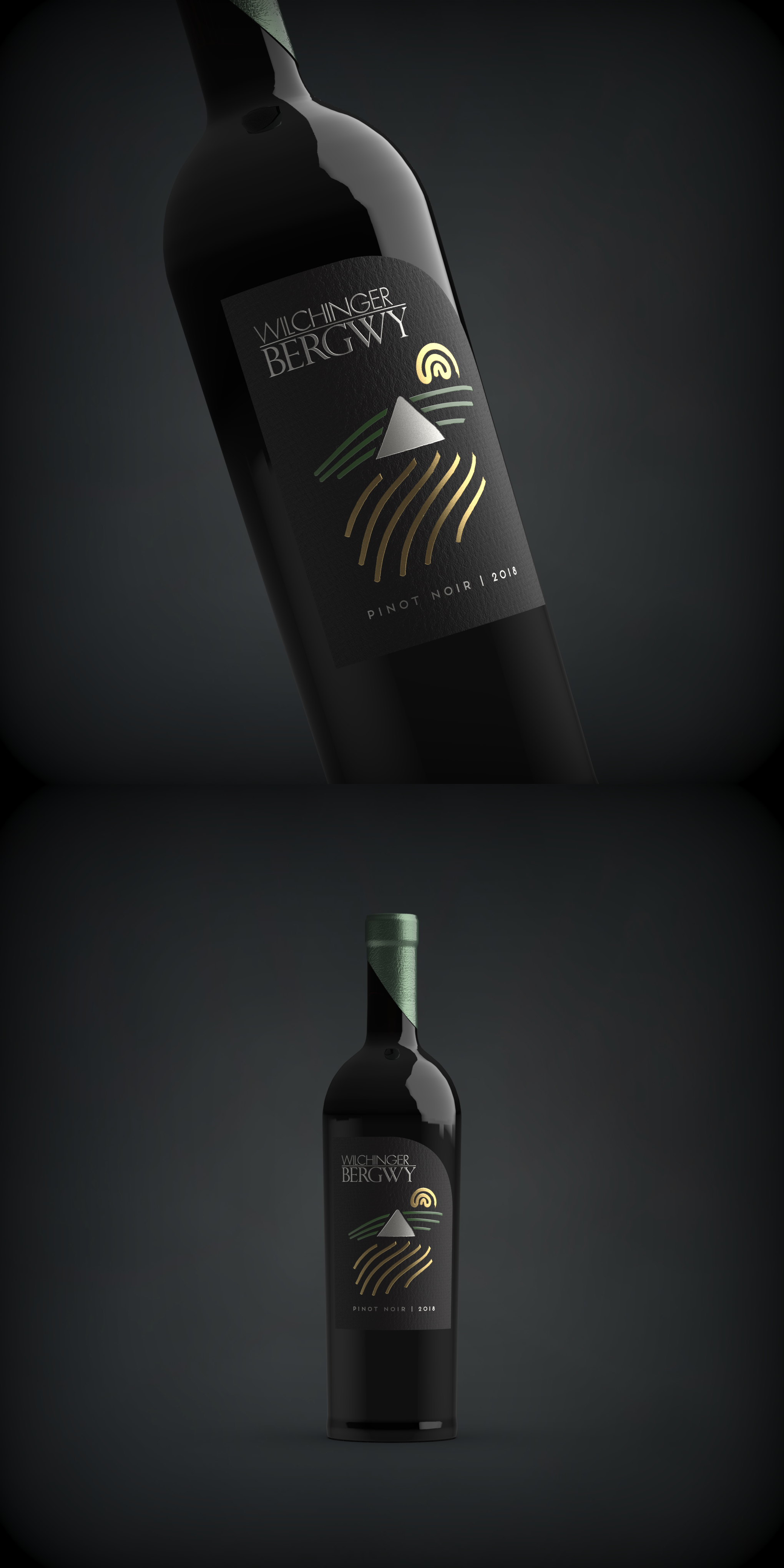
This wine label's concept is based on the layout of client's winery, with the mild hill slope behind the massive farmhouse and the wineyard in front of it.
As it's actually a redesign of their former labels featuring the sun in the upper corner - I've drawn the sun as well rising up behind the hill as well.
All elements are printed with the use of metallic foil in different colors, against a matte black paper.
Asymmetric capsule with a cutaway is also used as it adds to the overall design and the it follows the form of the label.
