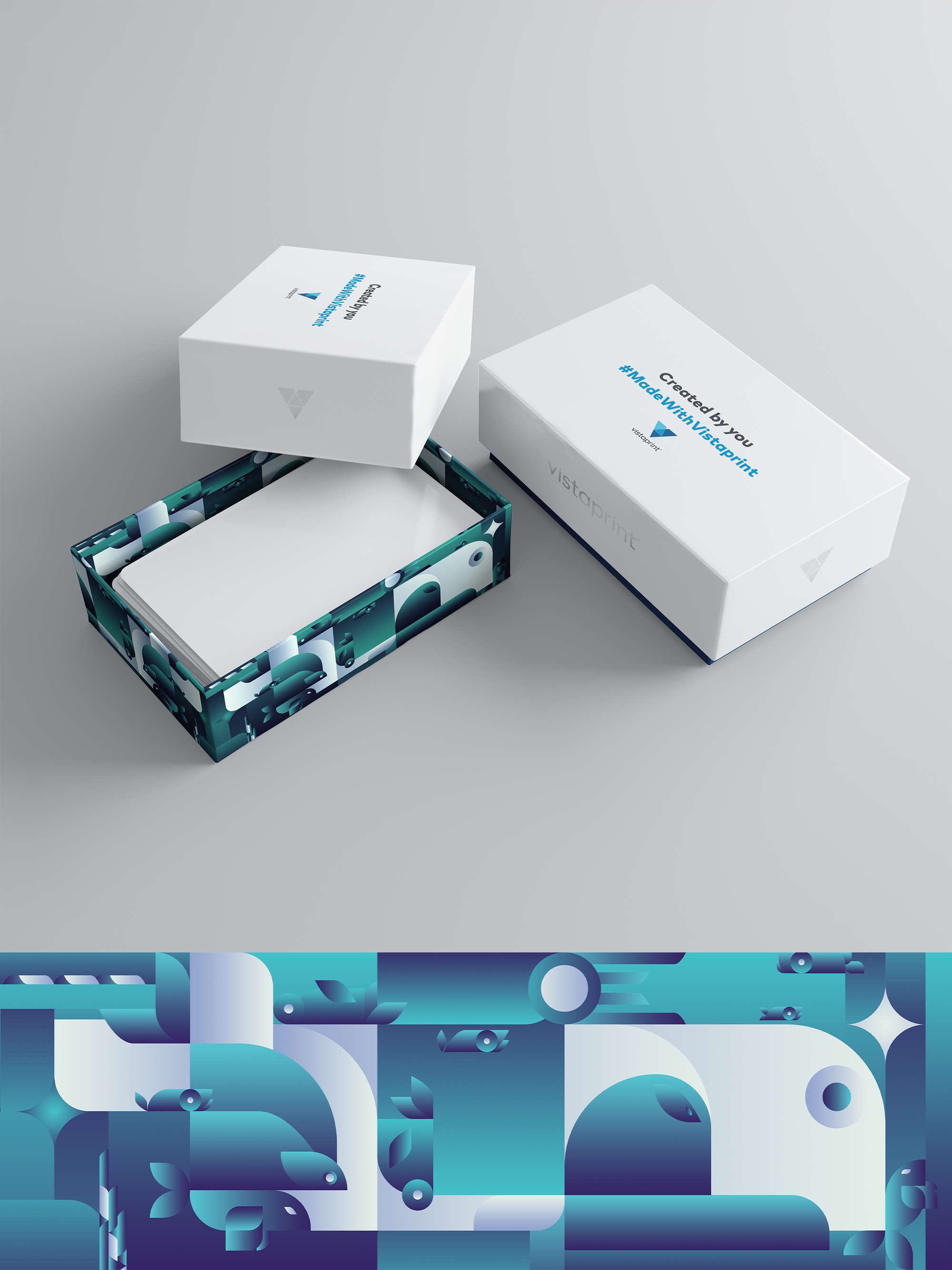
Vistaprint’s Premium biz card box design

2
Created on 99designs by Vista
A scenic view of the ocean, presented through geometrically abstract art gave me just the right feel. The blue gradients used are complementing the Vistaprint branding and are calming despite the complex structure of the design. Further, if color psychology is taken into account, blue would represent cleanliness, serenity, trust, and overall calmness and peace. Lastly, on the question "why ocean", I would say that the answer, besides expressiveness, could lie in practicality. The artwork is hidden beneath the lid of the box, just like the ocean's life is beneath its surface.