
Created on 99designs by Vista
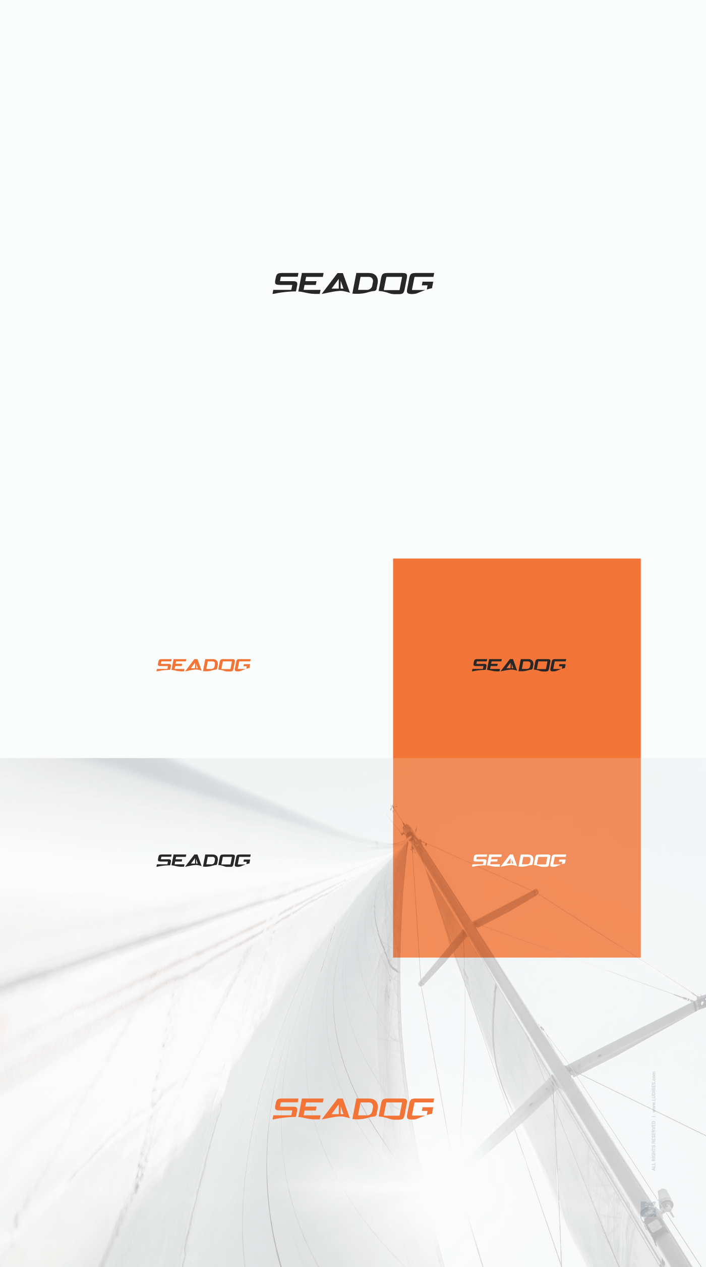
Client I worked with before is exapanding his business with fresh new kayak sailing tours, and for that purpose here is logo we designed. Like mother brand, this design is straight and simple, yet unique wordmark. This time with clever sail within negative space of letter A. Bottom part of this wordmark is cutted out in wave like fashion, and combined with minimalistic sail its spot on. Featuring mother brand color scheme and strong modern lettering, this logo is bringing a fun and vibrant brand personality to life :)