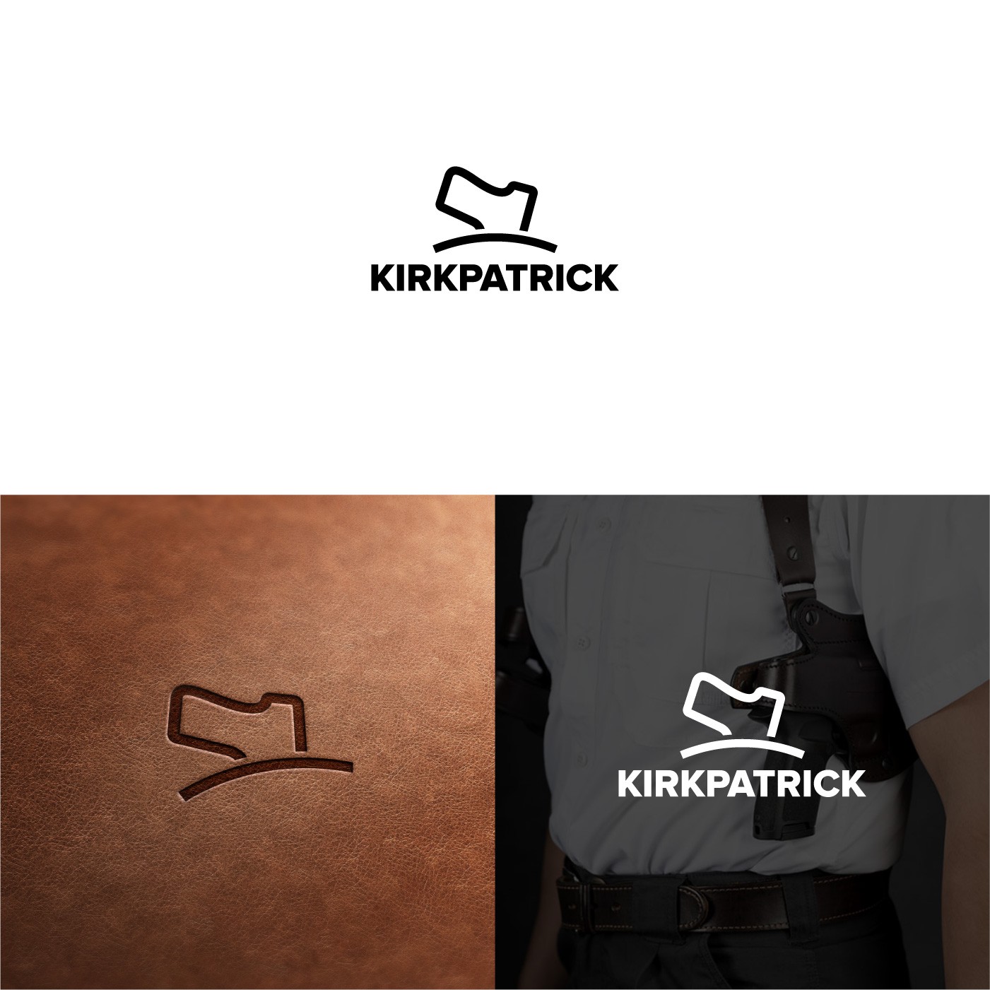

The concept behind the logo:
1. Symbolizes gun holster in a simplest way.
2. Appearance of the gun is simple, recognizable without being too obvious or cheesy. (The logo will be put on environments full of guns, even on the gun holster itself, so the depiction of a straightforward gun is unnecessary and outdated). With a simple hint is an elegant way to identify the Kirkpatrick brand.
3. Without the letter "K", to make Kirkpatrick logo with a letter K will be too obvious and shallow. The letter K will even be a distraction, overused and a "K" logo for Kirkpatrick can be mistakenly seen as a shoemaker or other leather products. I recommend using a logo without a "K". (Like the deer for Browning).
4. The holster. The holster is represented by a simple shape without specific model so the logo can cover the entire range of the company's products. A holstered weapon also symbolizes "We are The Good Guys", honorable and responsible gun owners.