
A good logo is the one that explains the whole company in just one glance. This is what I've tried to achieve here.
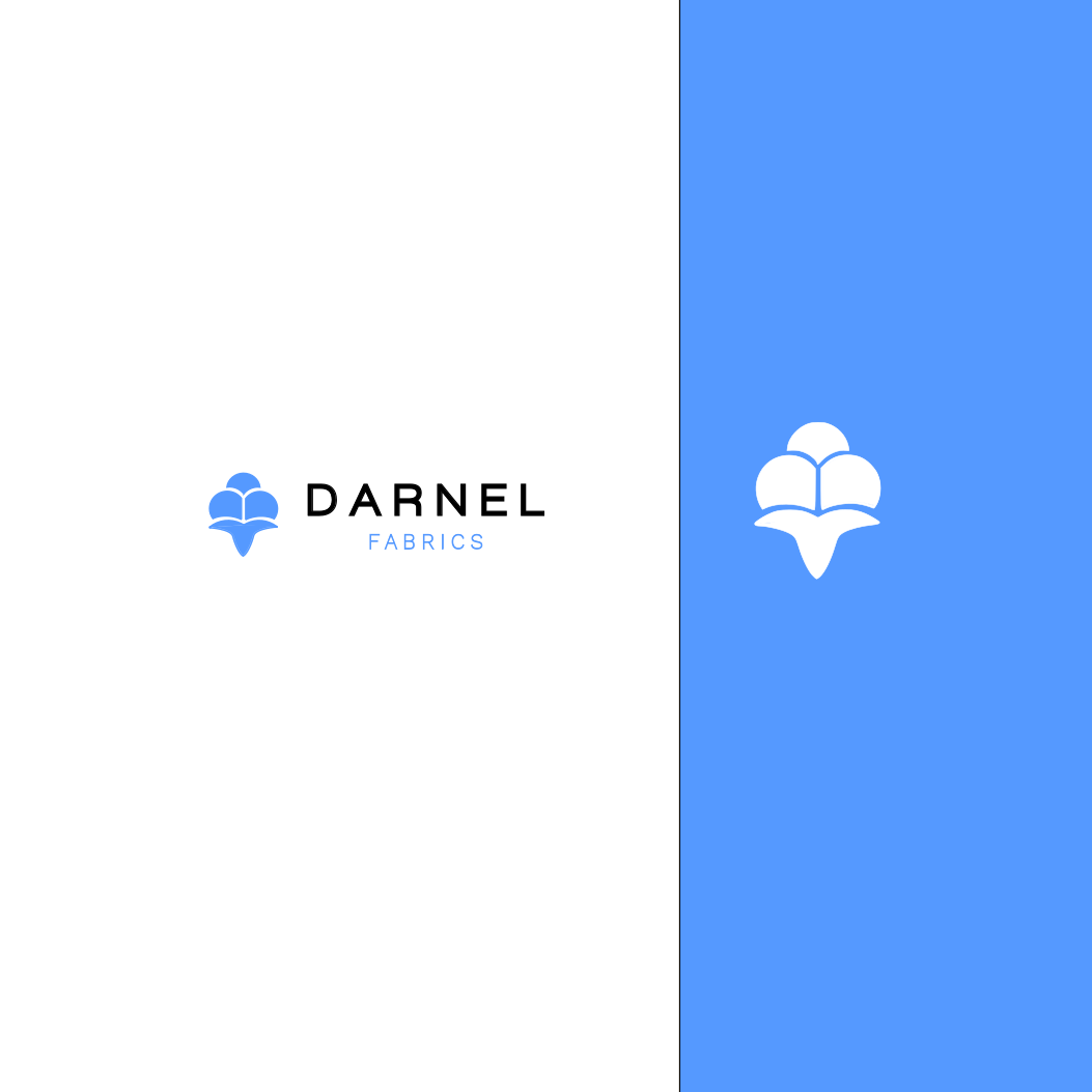
The main part of this logo is the cotton bud, we'll call him Mr. Bud. I believe nothing screams textile better than cotton. The advantage of having Mr. Bud is that you don't really need to incorporate the typography part everywhere, he can explain the whole pupose of your business by himself remarkably well.
Mr. Bud has a clean and modern design. He's not only purposeful but also aesthetically pleasing to look at.
The colors I've chosen for this project ( #5599FF and White) have a purpose behind them too. When I think of textile, I imagine something simple and light. And the combination of these two colours here do that exceptionally.
The choice typography was simple for ne. I went for 'work sans' to give it a depth of maturity to balance the playful nature of the logo