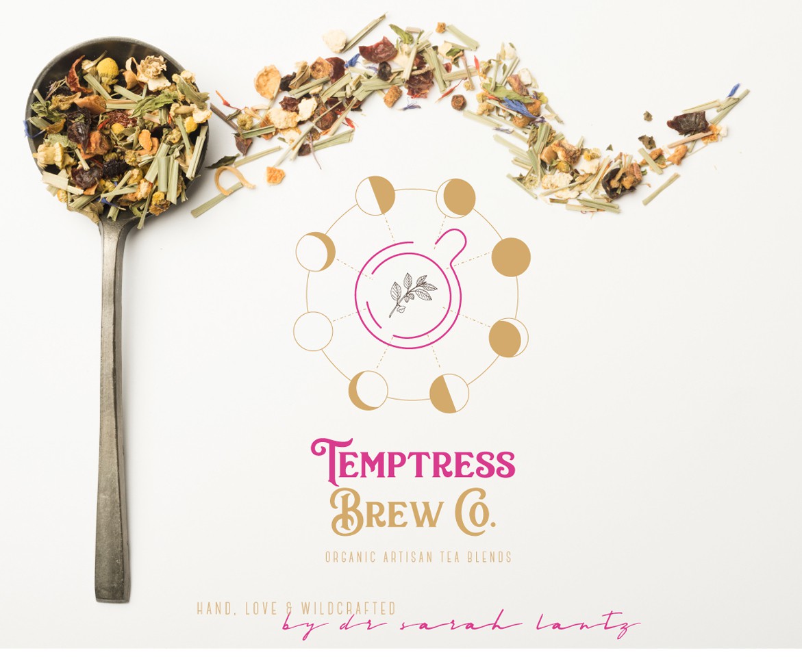

concept for artisan organic tea company
thoughts/inspiration :
inspired by sacred symbology, artisan crafting in alignment with nature
type:
i wanted the typography to be sort of a blend between 'ancient meets modern' the typefaces incorporate old apothecary + clean sans-serif style & an optional signature.
design:
top view of a tea cup iconography w/ an ashwagandha sprig speaks to the adaptogenic blends offered by the brand.
lunar phase symbols speak to the process of ceremonially crafting the blends aligned with nature - as described by the creator.
notes overall:
*i made deliberate efforts to stay away from cliche or stereotypical imagery that one would expect from the word 'temptress' and instead focused on crafting something that felt more aligned with the actual product itself vs. creating just another woman's face w/some flowers.
additional design concepts included: sacred geometry & lunar iconography, goddess symbology